Scrapbook Challenge

Sun Buddies

Glittery, Beachy, Summer Themes

It's Winter in So Cal and all we've had for weeks is rain, rain rain! While the storms are welcome, especially since the state has been a drought for years, I miss the the sunshine and beach days that are depicted in these Hawaiian vacation photos.

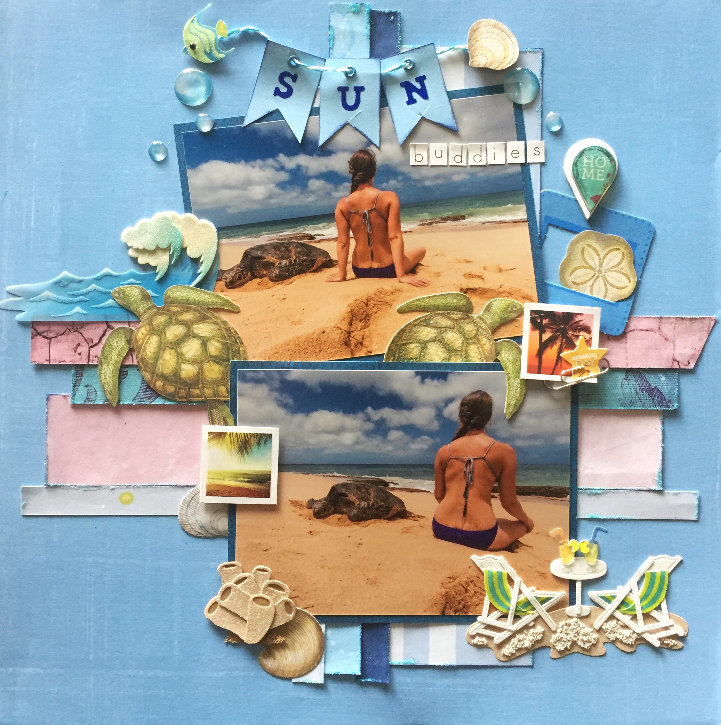
Depending on the time of year, turtle can be fund all over Oahu's beaches. Once on the brink of extinction, the green sea turtle has made a fantastic comeback after becoming a protected species. To even touch one is against the law! They come up on the beach to rest and sun themselves and don't seem to be bothered at all by people. This one was content to sleep while I read a book next to him and gazed at the sea.

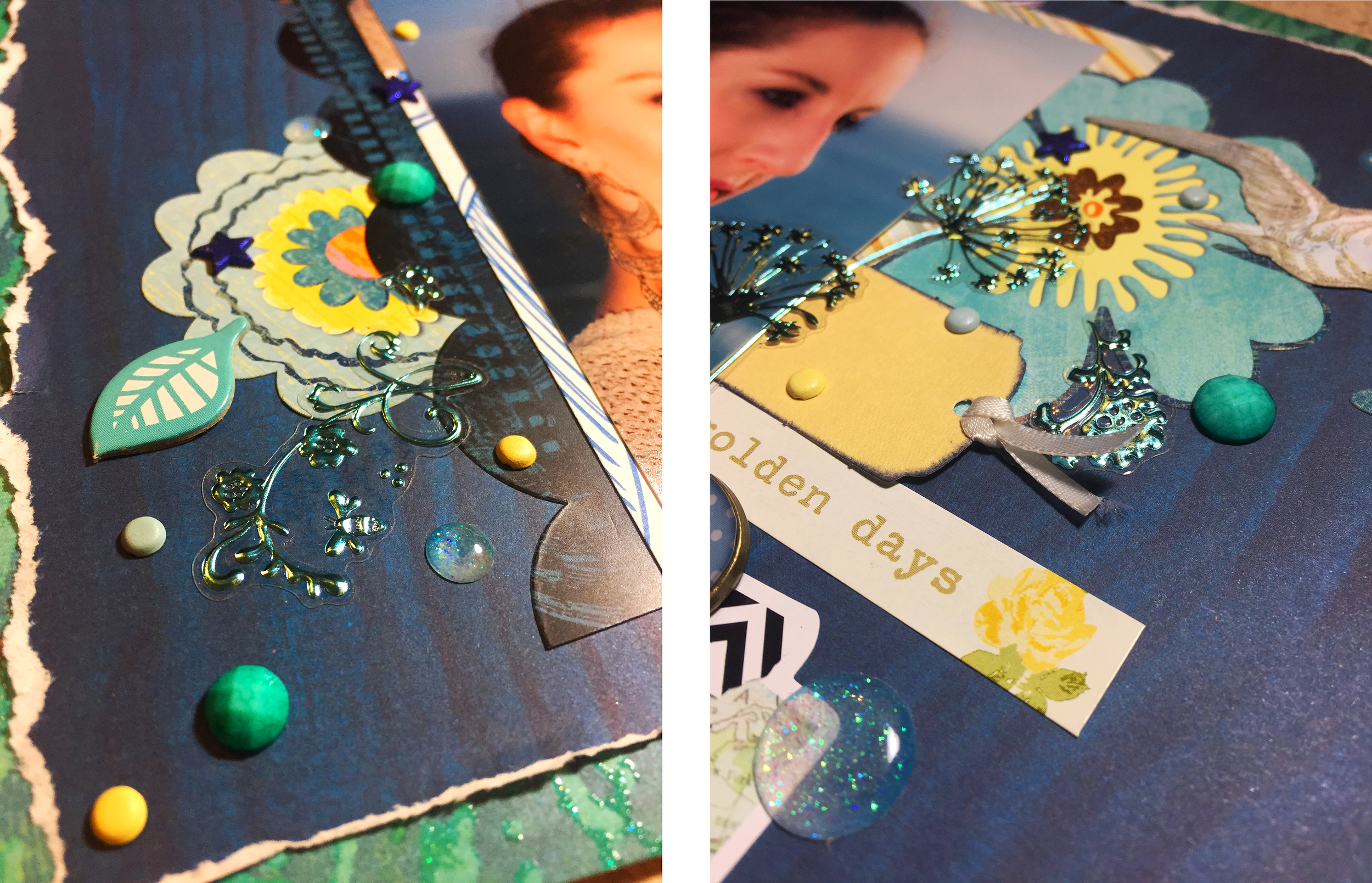
I used a blue background paper that had a subtle pattern and used old scraps that matched the color palette for the strips behind the photos. Each piece was edged with Mod Podge and then topped with Recollections Fairy Dust glitter in Frost. Embellishments used include Paper Studio's 3D stickers in Hawaii, Jolee's Boutique Beach Leisure stickers, and K & Company Travel die cut card stock.

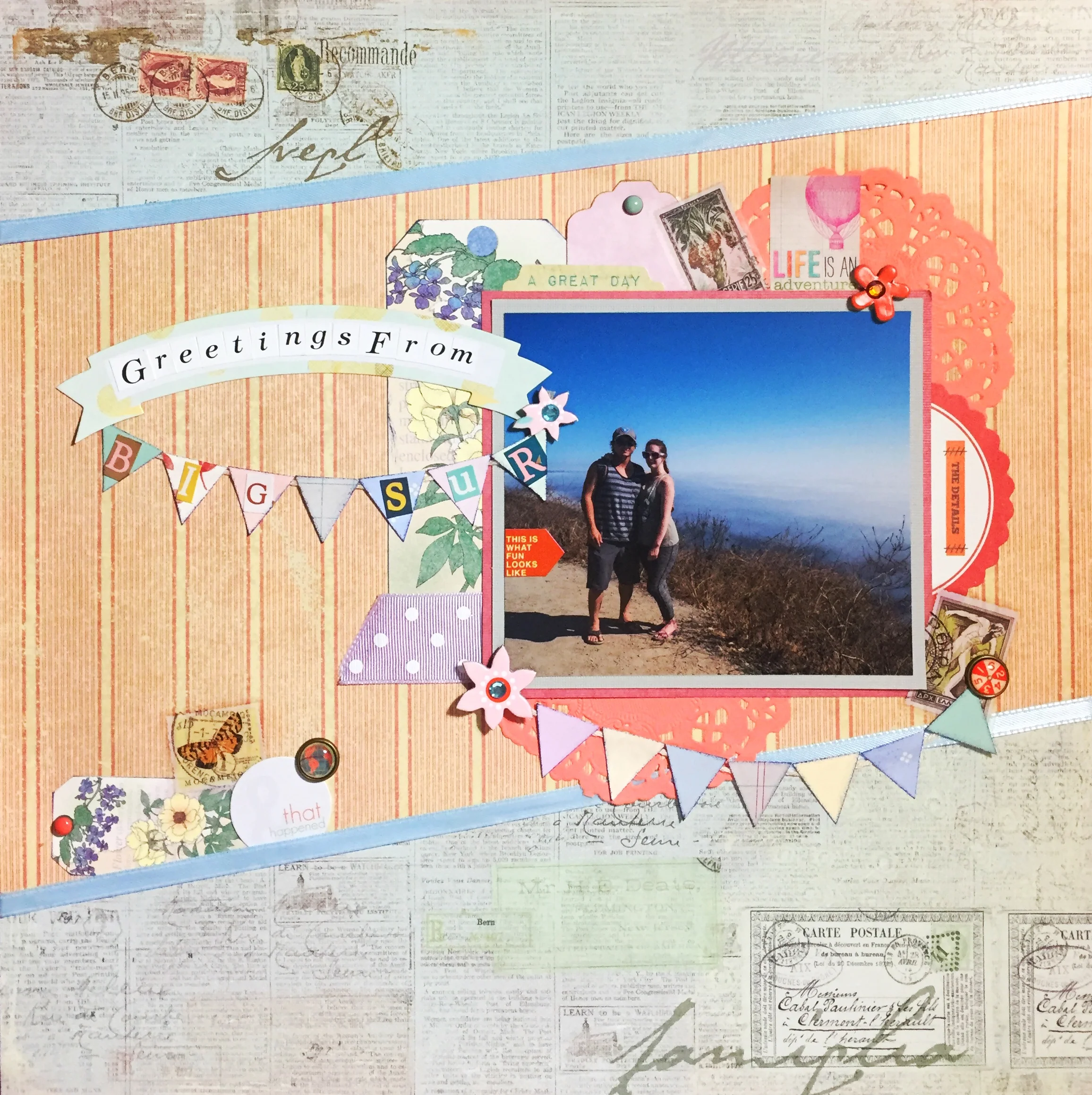
This color story by Design Seeds provided the perfect palette for this page. I loved the contrast of dusty pinks with cool blues and it went well with the photo's hues of sand, skin, sea and sky.

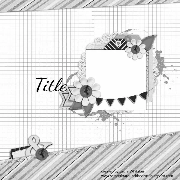
The sketch used was taken from My Creative Sketches' December challenge. This two photo layout worked well with my selected photos and left lots of room for embellishments. I liked the pennant banners and modified the number to work with my title.

This page as also made for the Scrap Our Stash January challenge. I love Tic-Tac-Toe challenges because they give you so much freedom in how t creatively integrate the challenge into your page. I chose to use squares "Twine," "Paperclip," and "The Color Blue."

Scrapbook Challenge

Greetings From Big Sur

Details, Details, Details!

Hey scrappers! I bring you another page done for a holiday challenge that is decidedly not holiday themed. It's not that I don't like Christmas, it's just that I don't have any Christmas photos at my disposal. 

This photo was taken during our Summer vacation in Big Sur, (the same trip with the cows from my previous post.) We pulled off one of the many turnouts on the winding mountain road to take this photo. Behind us is actually the ocean, but it was covered with mist so thick that it looked like a bottomless abyss.

I started with the blue postage themed paper from Prima Marketing's Botanical collection. I thought it worked well for a travel themed page. I paired it with red striped paper from The Paper Studio's Kellerkurtz & Company Square stack. It's simplicity balanced out the busy blue paper.

This page's sketch came from Stuck?! Sketches' December challenge. I love the pennant banner and the opportunity to add so many little details.

The color palette is from Color, Story, Inspiration's 220th case file. I liked the juxtaposition of the muted red with pale pastels. 

Evidence Used:

Testimony Used:

Other products used:


Scrapbook Challenge

A Home Without A Cat Is Just A House

Kitties, Pastels And Doodles

I had so much fun making this page! It's different from a lot of my other layouts because I don't do a lot of small paper piecing or big geometric cutouts, but this page ended up with both.

The houses along the bottom were inspired by ARTastic's December challenge. I used the picture's color palette throughout the entire page and used paper scraps to make little houses reminiscent of the original illustration. A Sharpie pen was used for all the little details.

Neighborhood by Lisa Frances Judd

Neighborhood by Lisa Frances Judd

The sketch for this page was taken from Stuck?! Sketches' December challenge. I used paper from My Mind's Eye Bramble Rose stack for the background mat and the giant star cutout. The titles was made with American Crafts Chipboard Letters in Petal. Additional embellishments include Sonia J Kawaii Cat Stickers and Momenta Word Play stickers.

Scrapbook Challenge

Hello Cows

Black & White, Red & Green

Good news friends! I finally figured out how on turn on comments. Is it obvous I'm a novice blogger? Now you can drop me a line if you so choose. I look forward to hearing from my fellow scrappers!

While others are scrapping pictures of their loved ones opening presents and other holiday events, my page this week features...cows. Why not? These photos were taken in Big Sur during our Summer vacation. The background is hazy and smokey because much of the local forest was burning in one of the year's biggest wildfires! We weren't in any danger and neither were the cows, but many of the state parks were closed, forcing us to find other things to do...like take pictures of cows.

I started with a subtle green textured paper from K & Company's Color Basics Imbue pad. A black and white damask print with a red mat made for great contrast. Embellishments like buttons, mini star brads and black adhesive dots tied the page together.

The layout and color palette were both inspired by Color, Story, Inspiration's 219th case file. It's definitely a Christmasy collection of colors but I put a spin on it by not featuring any sort of holiday theme at all. I turned the sketch 90 degrees to better fit my photos.

Evidence Used:

Testimony Used

  • Wrap up your journaling somehow (Gray alphabet letters wrapped with baker's twine)

Scrapbook Challenge

Laguna Beach

Glitter, Metallics, And The Colors Of Autumn

As chilly, windy winter weather sets in, my trips to the beach become less frequent. Reading books in the sand is replaced by replaced by reading books under an electric blanket.  Not quite as glamours but now I have a good 4 months to eat cookies and Starbucks holiday drinks without worrying about keeping up a bikini ready body.

This photo was taken at Laguna Beach's picturesque Crescent Bay beach. Despite it being Spring, the warms tones of the photo seemed perfect for an Autumn layout. I like how this layout feels mildly Fallish without aggressively featuring cliched pumpkins, fallen leaves, turkeys or cornucopias.

I started with a subdued gray and white patterned paper from Momenta's double sided cardstock stack. This collection is unique because all patterns are in complete gray scale, providing a truly neutral selection of papers.

A taupe and gray paper from The Paper Studio's Kellerkurtz & Company stack as well as assorted scraps of plain and patterned cardstock made up the rest of the background. Each piece was outlined with a metallic gold Sharpie.

Since this page was done for the Lasting Memories' December challenge of "Glitter and Glam," I went overboard with glittery and metallic embellishments. The title was made using Dear Lizzie foam gold glitter stickers. Dark sparkle was added to the center of white flowers with Queen & Co. Deco Dots in Black, and dimensional star stickers by Jolee's Boutique and Recollections' shell brads were scattered among the flower clusters.

The color palette or this page was taken from the inspiration picture at The Studio Challenges' December post. The image of a Fall themed table setting had to inspire that created page in some way.

Keeping true to the picture, the main colors I used were various shades of gray with touches of deep orange, black, brown and gold. I applaud the non traditional take on Fall this table setting evokes and wanted to replicate the same feeling in my page with a marine twist.

Other products used:

Photo by Stan Moniz

Scrapbook Challenge

Golden Days

Shades Of Blue And Turquoise Too

Some of the perks of living in Southern California include warm, wonderful beach weather all year long. While these pictures were take during the height of summer, it was only last week that my husband and I went to the very same spot so he could take photos of the sunset.

This page was modeled after the November sketch at Stuck?! Sketches. It was perfect for showing off two vertical photos. I was particularly inspired by design member Morag. I really liked her interpretation with torn paper and lots of embellishments.

This color palette was taken from Color, Stories, Inspiration's 218th case file. The blues, turquoises and yellows were a wonderful compliment to my beachy, blue background photos. I chose the make dark blue the feature color to really make the photos and yellow accents pop.

Evidence Used:

  • Dots/Speech Bubble (Speech Bubble Paperclip Embellishment)
  • Animals (K & Company die Cut Card Stock Travel)
  • Circles (Jolee's Boutique Dimensional Stickers Waves)

Testimony

Scrapbook Challenge

To Dance Is To Live

Layers And Lace

Some kids grow up playing soccer or laying piano or taking karate. For me, it was dance. Jazz, ballet, tap, lyrical, you name it, I did it. From the age of 4 to my mid twenties I was in class at least five days a week and sometimes more. While going through stacks of old photos, I found a bunch of wallet sized pics take on "photo day." Every year, shots were taken in that year's recital costume, and while I'm sure I had many more pictures than this, these are the ones that found my photo box.

This week's layout was inspired by Creative Scrapper's 300th Sketch. Its small panels were perfect for my tiny photos.

I added five photos instead of four and changed around where the title and journaling went. A Michelle Shefveland sticker made for the perfect title. Odds and ends from my stash like Karen Foster stickers and Prima Marketing butterflies added the final embellishments.

http://artasticchallengeblog.blogspot.com.au/2016/11/our-mid-month-reveal.html

ARTastic Challenge's November reveal features The Summer House by Hilda Rix Nicholas. The page had to be inspired by the image and have a vintage theme. I drew from the color palette, using a lot of blues, grey-purples, and even a splash of orange and yellow. I incorporated a vintage feel with the aged wood and old paper patterns.

Scrapbook Challenge

Apple Of My Eye

Foxes, Fall And Green Apples


Hey friends! This week I bring you a page that's inspired by the warm tones and falling leaves of Autumn. The layout I used called for two photos so I cut one photo in half to make it work for the sketch.

This page really revolved around the green apple paper by Paper Pizazz. The challenge this page was created for had the use of apples in some way. Both the paper and the title became the base for the rest of the page. Many of these embellishments were added to fulfill parts of the challenge and as a result, created a page that I never would have come up with otherwise. 

This week's challenge is Color, Story, Inspiration's 217th Case File. The color palette set the tone for the page and I decided to predominantly feature light green tones with the apple paper. Silk leaves and green adhesive dots continue the green theme.

Evidence Used

Testimony Used:

  • Write 3 important things about your photo

Scrapbook Challenge

Cute Fuzzy Adorable Wild Floof

Going Green With Lots Of Letters

This week's layout is fun and fresh, more reminiscent of Spring than Autumn. I miss Summer's warm weather and sunlight after 5pm, but I'm ready for winter rains and Christmas cookies.

This simple page started with a green mandala print from the Everyday Tango stack by My Mind's Eye. I love the touch of glitter on the blue paint, although it doesn't really show in the photographs. I pulled some scraps from my leftover paper bin and utilized them as stripes and photo mats. A few embellishments and a whole lot of alphabet stickers added the finishing touches. The idea for so many letters was inspired by an old challenge from shimelle.com in which the idea was to use as many letter stickers as possible. After digging through my sticker stash, I found a different font for every word. I really like the end result and what a strong design element the title became.

I liked the palette The Studio Challenges chose for their current challenge. I emphasized green and blue tones because they matched my kitty's eyes so well. I love the diagonally lined paper from The Follow Your Heart pad by My Mind's Eye because it so perfectly ties together all the colors and adds a dash of that goldenrod color that wasn't emphasized anywhere else.

I found a sketch I liked from Grand Diva's Creative Corner. I only recently discovered her blog and I thought this particular sketch fit my photo perfectly after i turned it 90 degrees. I even recreated the pennant flags with some baker's twine and more paper scraps.

Here are a few more products used on this particular project:

Scrapbook Challenge

LACMA Lights

Blue Tones And L.A. Landmarks

I've come to the end of my stash of recent photos so I've been digging deep into a box of ancient snapshots. Among old homecoming dance photos, pictures of high school friends and envelopes of negatives (yes, negatives! Like, from a FILM camera!) I came across those shots taken at the LACMA. My sister and I went to the Los Angeles Contemporary Museum of Art several years ago when the Tim Burton exhibit was in town. All these lamp posts are out in front of the museum and have been featured in countless movies and photo shoots. When the sky grows dark and they all turn on at night, the atmosphere is quite magical. If you're ever in the neighborhood, I definitely recommend a visit!

The first November challenge over at Lasting Memories was the use of squares on the page. This criteria was met by cutting the photos themselves into squares as well as using a square shaped canvas sticker by Paper House. I like how it also added a pop of red among all the blues.

For this particular page, I started the process a little differently. Since none of the challenges inspiring this page included a color palette, I went to Design Seeds for some inspiration. This site is fantastic for anyone who loves color. My husband and I actually painted our last apartment using color pairings found on this site. Using their color search tool, I looked for selections that would pair nicely with my photo. This is the one I decided on:

The layout itself was taken from the November challenge at Stuck?! Sketches. The layout was so simplistic that I ended up embellishing it and adding a little more to it and moving where the title was meant to go. I stuck with a simplistic background from the Royal Garden Stack by DCWV. I love the blue tone but it's unusual shiny finish made it difficult to photograph without glare. Textured teal card stock from The Paper Studio's Affinity Stack made for a great mat.

A few other items used on this page are listed here:

Scrapbook Challenge

What The Fluff?

Pastel Pinks And Tiny Tags

Hey scrappers! October is national Breast Cancer Awareness month and this page was done as part of a challenge in which the color pink had to be prominently featured.

This is my kitty Jupiter giving me a look of disapproval. She so expressive that I can't help but laugh at all of her ridiculous grumpy faces. Her pink nose was the reason I chose this photo for this layout since I knew the color scheme was going to include pink.

The color palette for this page as inspired by the ARTastic Challenges October post. The criteria was that the color pink had to be used in the layout but I liked the entire palette of the inspiration photo.

I started with blue floral paper from the DCWV Be Mine stack, a Valentines themed collection that perfectly matched the palette I had in mind. Multiple photo mats and lots of little embellishments around the edges keep the singular focus on the photo.

The layout it adapted from Creative Scrappers 299th sketch. The original called for four photos but I didn't have any photos small enough to work. Instead I used one giant photo and altered the layout accordingly.

Scrapbook Challenge

Journey

Rich Ruby Tones And Hawaiian Waterfalls

These shots are from our 2015 Oahu vacation. We stayed with some friends near Honolulu and went on a fantastic hike that ended at Manoa falls. The misty air at the top felt great after thehike that was pretty much all uphill. I don't hike much so trust me, this was a big accomplishment for me!

This page was created for Scrap Our Stash's October sketch challenge. I turned the sketch 90 degrees counter clockwise to better accommodate the photos I had to work with. From the columns I chose all three colors, (Desert, English Green and French Wine,) and added Flowers from column three too just for fun.  

I started with burgundy patterned paper from the Everyday Tango stack by My Mind's Eye and layered in papers in green, tan and purple tones. I embellished with green paper flowers by The Paper Studio and a wooden token by Maya Road and finished off with assorted buttons, silk flowers, and glass beads from Robin's Nest.

Some of the other products I used are listed below:


Scrapbook Challenge

Here Kitty Kitty

Pastel Papers, Silk Flowers and Stamps!

Hello friends and welcome to my very first blog post!At the heart of every scrapbooking page I create is a photo that is important to me. Now that I've acquired a phone with a camera that is superior to my ancient point-and-shoot, I can snap a pictu…

Hello friends and welcome to my very first blog post!

At the heart of every scrapbooking page I create is a photo that is important to me. Now that I've acquired a phone with a camera that is superior to my ancient point-and-shoot, I can snap a picture anywhere, anytime. Selfies have become a way of life.

This particular photo was taken on my patio where I take many selfies on the days that my makeup turns out nice. (Come on ladies, you know you get excited when your winged eyeliner is on point!) On this particular day my pretty white cat Europa joined me outside and after many attempts, I was able to snap this fun pic of us.

I started with basic white card stock and used watered down acrylics to paint the background since I didn't have actual watercolors on hand. The water from the paints will war the paper so I recommend letting the page dry completely and then leaving several heavy books on it over night to flatten it out.

The mason jar detail was created with a rubber stamp and blue vellum. I placed silk flowers below the vellum to make it look like the jar was full. Puttingfew flowers on the top gave me a way to hide the adhesive that is mounting the vellum to the background.

This page was inspired by Color, Story, Inspiration's 215th case file. I love the quirky illustration and pastel color scheme.

Evidence Used:

Testimony Used:

  • Journal in wavy lines (I used a series of circle stencils to give me a template for my journaling)

I used the Studio Challenges' October 9th Sketch.

For the title, I used a sticker from Paper Studio's Cat Sayings sticker sheet and paw print embellishments are Kitty Puffy stickers by Paper House. The paper kite is from the Song of Spring pack by Paper Embellishments.