Color Dare Design Team Challenge #598

Shine Bright

Shades Of Pink, Yellow And Green

Hi everyone! I’m here with another Color my Heart Color Dare challenge! This one starts 4/26 so I hope you will head over to their site and play along!

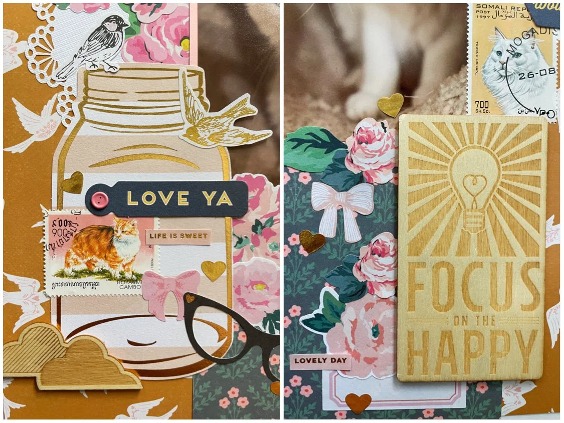
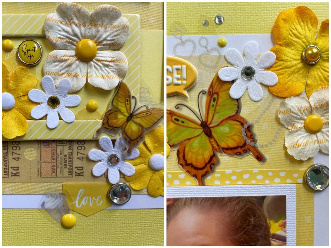
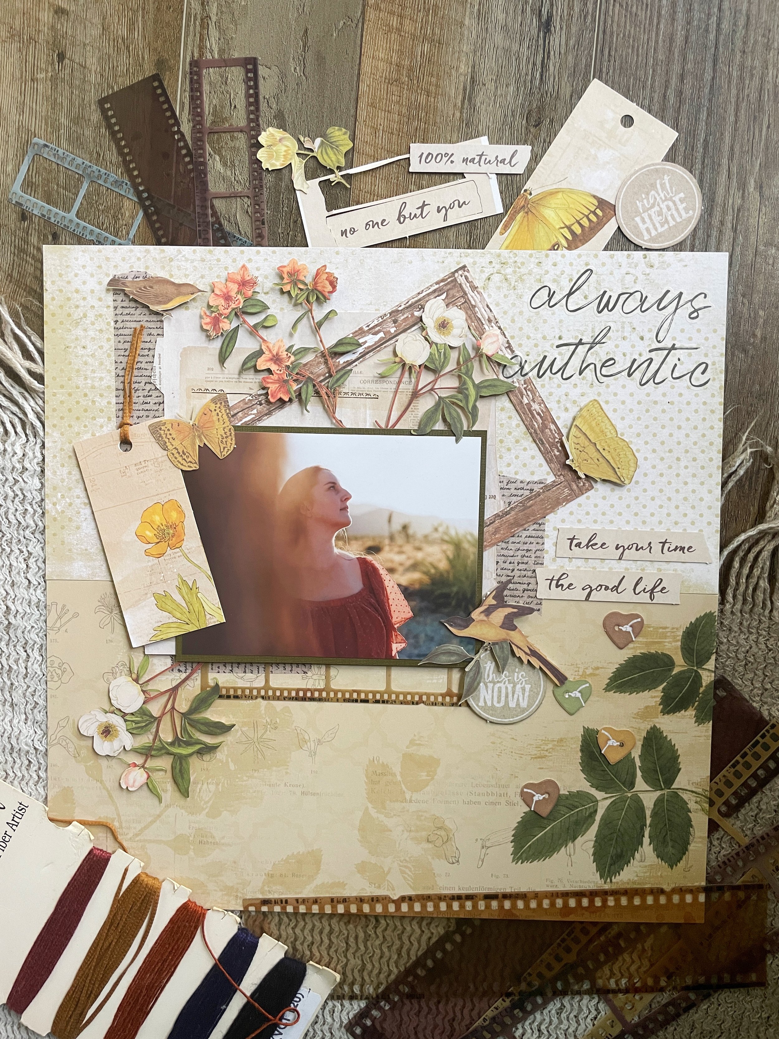
I started with some yellow ombre paper from the Paige Evans Whimsical paper stack. I then cut down some floral paper from the Maggie Holmes stack by Crate Paper. I layered a pink striped paper scrap and paper from the 6 X 6 Bloom stack, also by Crate Paper. I used some clear die cuts by Stamperia. These are unique since they are made from plastic rather than paper die cuts. They remind me a little of Shrinky Dinks from childhood. I used Mini Glue Dots to tac them down since the adhesive is clear and some of the die cuts were slightly transparent. I added some glittery bird accents by K & Company. I’ve have had these a very long time and am still nowhere near using them up but I am one step closer! I splattered some white acrylic and shimmery watercolor paint over the whole page as a finishing touch.

The color dare challenge this time gave a little freedom in what shade or tone of pink, green and yellow were used. I ended up using multiple shades of all three colors plus some white and cream. I hope you’ll join us at Color Dare with your own take on the challenge!

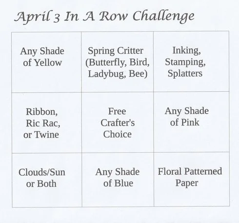
This page was also made for the 3 in a Row challenge over at A Cherry on Top Crafts. I ended up completing a column, row and a diagonal by incorporating the following:

  • Yellow

  • Spring Critter (Bird)

  • Paint Splatters

  • Pink

  • Floral Patterned Paper

That’s all for this week! Thank you for stopping by my page and I will see you soon with a brand new layout to share.

Scrapbook Challenge

Meow

Using Silly Stickers

Hi scrappers! This week I made a silly little page featuring my cat Jupiter. She’s so goofy sometimes, and her personality really comes out in this photo so I made an equally silly page.

I started with some red paper that had the word “meow” all over it from the Roxie & Friends collection by Photo Play. Although I don’t even remember purchasing them, I have several products from this collection that really worked well on this page. The title sticker was from their 12 X 12 sticker sheet and I used a few pieces of matching ephemera too. The best part of this page though is the little sarcastic animal stickers by Sticko. I love all the sassy quotes because I feel like cats would absolutely say something like it if they could. I tried to use up the whole sheet but had a few to spare. I think the hedgehog is my favorite.

I used sketch 373 over at A Cherry on Top Crafts. I was inspired by the speech bubble elements to use the animal stickers since they also had little speech bubbles. I was lucky that I happen to have a big speech bubble sticker that I was able to use as the title. Instead of polka dots, I used some rainbow star print paper by Recollections.

That’s all for this week. Short and sweet! If you are interested in quiet ASMR unboxing videos, I have posted a few on my YouTube page. There is a playlist for unboxings, time lapse videos, ASMR scrapbooking videos, etc. I hope you’ll drop by!

Scrapbook Challenge

Happy In A Million Little Ways

Leafy Greens, Peaches And Teals

Hi scrappers! This week my page features a photo that was taken at our friend’s wedding. They had a photo booth there that printed the images for the guests on the spot which was really cool! Other photo booths I’ve seen with usually just email or text a digital image. They had lots of fun props too but my favorite was the speech bubble I am holding.

I started with some brick patterned paper by Maggie Holmes as my background. I then cut down some Honeysuckle paper by Memory Place and rounded the corners with a Marvy Uchida punch. All other paper used was out of my stash of scraps.

I used several text rub-ons from 49 and Market’s Nature Study Foliage set and used a sticker from Crate Paper’s Modern Farmhouse sticker book as my title. I feel like I ended up covering the majority of the rub-ons by accident. Why do I always do that?? I opened up a layered embellishment set by 49 and Market that I’ve had for a long time but never used so I tried to add as many leaves, cameras and enamel dots as I could. I love the heart-shaped wooden sign and feel like it’s perfect for a page with my husband and I!

This page was made for the music challenge over at A Cherry on Top. I chose this album cover from Stevie Nick’s Trouble in Shangri-La album. I loved the colors and the mystique of the image. I used peaches and teals like in the image and replicated the archway shape by using a chipboard window from the Stamperia Cats and Orchids collection.

This page was also made for the April Sketch with a Twist challenge. The twist was to add leaf embellishments which I definitely had plenty of! I didn’t have a sticker or a die cut that would replicate the lacy, cut-out detail at the bottom of the page so I just used a paper scrap and added a solid blog along the bottom with a non-decorative edge.

That’a all for this week! If you’re looking for a scrapbook or card making challenge to participate in, consider dropping by Color Dare Challenges. The current challenge is running until 4/18/24!

Scrapbook Challenge

Fabulous

Purple, Pink And Gray

Hi everyone! This week, I made a page with some bright, fun photos that were taken at brunch in Laguna Beach.

I used some gray text print paper from the Colorbok Mixed Media stack and mounted it on dark pink cardstock since it was very thin. I used paper scraps for the vertical accent on the left as well as the mats for my photos. The title comes from a Shimelle sticker book and I embellished with some puffy stickers and enamel dots by Simple Stories. I added some washi cocktail stickers which fit this theme perfectly and used some pink and purple acrylic paint to add lots of splatters.

This page was made for the April Video Game Challenge at A Cherry on Top Crafts. Purple is my favorite color so I was excited about this color combo! I tried to adhere pretty strictly to the color palette, making gray my main base and then added colorful accents.

This page was also made for the Cherry Lift challenge. I chose this adorable layout to lift since I liked the detail on the lefthand side and the hexagon details. I added some camera stickers as well by Navy Peony as a nod to the original layout.

That’s all for this week! I’ve been having a blast with the various scrapbooking challenges around the net this month! If you are looking for one more to participate in, join me at the Taylor Swift challenge I host every month at A Cherry on Top! See you all soon!

Color Dare Design Team Challenge #596

No Wifi Here

Black, Brown And Pale Green

Hi scrappers! I’m back again with a page I created as a part of the design team over at Color my Heart Color Dare Challenges. Please drop by and take a look at all the beautiful entries our participants submit. This particular challenge will start 4/12.

I used some photos my husband took of me in Joshua Tree. I grew up with dance being a big part of my life and while I don’t teach or take classes now, I will revert to my dance lexicon when posing for the fun landscape photos my husband will sometimes take. I love how the rainbow dress I wore contrasts with all the brown of the landscape. Having lots of brown in my layout makes those bright rainbow colors pop even more.

Since I have been collecting scrapbooking products for so long, I have more paper than I’ll ever be able to use and I keep telling myself I won’t buy anymore. However, I saw this Naturalist paper stack by P13 and broke my own rule. Every paper in the collection is gorgeous and the quality is top notch with the paper being nice and thick. I used the brown paper as my background since the little branch designs matched the texture of the foliage in my photo.

The green paper is from Vickie Boutin’s Evergreen & Holly stack by American Crafts. I received this stack in a blind box and didn’t think I would get a lot of use out of it since I didn’t have very many Christmas photos on file. I’ve ended up using this stack lots of times and usually not for Christmas themed pages! The paper really works well here too and the design is abstract enough that it doesn’t look overtly like snowflakes.

Most of the embellishments are either ephemera bits or laser cut elements from the 49 and Market Nature Study collection. This collection has been getting lots of use since so many of my photos are taken outdoors. They really look great here and there were lots of brown embellishments to choose from.

I finally found a home for the corrugated tag I’d had in my stash forever and added some Heidi Swapp definition stickers as well as (you guessed it) enamel dots by Altenew and Simple Stories.

The Color Dare challenge this time allowed for a little more freedom since I could choose any color I wanted to go with black and brown. I chose a light spring green which contrasted beautifully. I don’t think I ever would have put together this color combo on my own. I don’t use a ton of black in my layouts anyway even though I have tons of black paper since it usually comes as filler in the 12 X 12 albums I buy to house all my finished pages. Black looks great here as an accent color in the text stickers and photo mats and isn’t too overwhelming. Why don’t I use black like this more??

I used sketch 294 from Sketch N Scrap. This sketch was so simple but allowed me so much room to play! Instead of a large flower, I used a circular twig embellishment and layered additional embellishments all over the place (but what else is new?) This was a perfect opportunity to use a series of three photos and I just happened to have this trio in the stash.

That’ll for this week. Thanks for giving my page a peek and I will be back soon with a whole new page. I think I’m in the mood for something bright and colorful after this brown-toned page. See you there!

Scrapbook Challenge

This Forever

Peacock Colors And Sparkles

Hi scrappers! I was digging through my stack of photos and found this old picture from when my husband and I were first dating. We were both much younger and skinnier!

I started with some teal peacock feather paper from the Summer Dream stack by Craft Smith. I embellished with laser cut elements and ephemera bits from the 49 and Market Viken collection. For some reason I had some peacock feathers in my stash so I cut one down and used a Sizzix shaker pane and corresponding die cuts to create a shaker. I had a ton of random beads and sequins so I added some inside the shaker before sealing it and then hand-stitched various sparkles all over the page.

I used the weekly sketch from A Cherry on Top Crafts for this page. Since I didn’t have three small photos, I improvised with a medium sized photo and shaker. I used Viken fabric tape by 49 and Market for the stripes down the right side and lots of flower ephemera instead of hearts.

I used the color palette from challenge #123 over at Challenge Yourself. This color combo was so pretty and I was able to incorporate peacock feather paper and an actual peacock feather on my page!

That’s all for this week! You can find more Scrap Attack content on Instagram and YouTube. I’d love to see you there!

Scrapbook Challenge

The Midnight

Primary Colors With Cocoa Brown

Hi scrappers! This week I used some primary colors and a brown background and even my photos matched the color palette! These photos were taken when I went to go see the band The Midnight live in downtown Los Angeles. I had seen this band once before at a music festival but this was their own show and they were amazing! If you like electronic music with a new wave flare and epic saxophone solos, you should give them a listen!

I used a piece of brown cardstock from the Affinity stack by The Paper Studio. I had a scrap of primary color finger paint paper that has been in my stash for years (maybe decades?) and I used up a chunk of it by cutting some two inch squares. I used various strips of washi tape, both by Kimono and Crate Paper and used some varnish stickers for my title. The arrow came from the same sticker sheet. I added a few crushed velvet brads by Doodlebug Designs to hold down some square tags and some brads and stickers from the Go See Explore collection by EchoPark Paper. I added some enamel dots by Carta Bella to finish.

This page was created for the March Video Game challenge at A Cherry on Top Crafts. I usually don’t use all primary colors too often so this was a challenge! I was excited to find those photos in my stash that were the perfect shades of red and blue.

I used Becky Fleck sketch 370 as inspiration for this page. I liked how some of the squares had rounded corners and some did not. I decided to add washi tape strips rather than journaling on the right side

That’s all for this week. Thank you for stopping by and I will be back, probably in April with a brand new page!

Scrapbook Challenge

Twins Today

Peacock Teal

Hi everyone! This week I scrapped a photo of my cat and I. She has two different colored eyes so I did my makeup to match. My husband took these fun portrait shots and I think they turned out really nice!

I started with some basic white card stock as my background and added some teal paper byPaper House. One side had the botanical damask pattern I used on the right. Theater had stripes of different patterns that I cut apart and placed under my photo on the left. I wish I had cut the strips a little longer so more of the different patterns could be seen! I hand stitched a row of sequins at the bottom and placed some adhesive rhinestones in a line across the top. I had some peacock embellishments by Jolee’s in my stash forever that worked perfectly on this page. I also used some peacock brads (and one that says “cat’s meow”) by Bo Bunny. I finished up with some rhinestones and gemstone encrusted flowers.

This page was made for the March 2024 scrap life challenge at A Cherry on Top Crafts. I used this sketch by Celeste B as my template. I liked all the paper strips and the rows of brads and sequins and wanted to recreate that on my own page.

This page was also made for the White with One March challenge This month’s color was teal and their mood board is absolutely gorgeous! I was inspired to use peacock elements and, of course, to feature a cat. The challenge also called for lots of bling, which I tried to incorporate through all the rhinestones and sequins.

That’s all for this time! Thank you for for visiting my page and I will be back soon to share another page!

Color Dare Design Team Challenge #594

The Great Escape

Scarlet, Periwinkle and Sapphire

Hi scrappers! I’m back with another Color Dare challenge! I used a selfie that was taken in Death Valley National Park. My husband took some really cool landscape portraits of me while we were there so hopefully I’ll get around to scrapping those soon!

I found an old piece of pale bluish paper with the circular dot pattern and cut that down a little. Both the background red paper and the red star paper are from the Vickie Boutin Evergreen & Holly paper stack. I had already used part of the red frame from the Bo-Bunny Star-Crossed collection on another page but had plenty left over for this page. I added another frame and filmstrip from the 49 and Market Nature Study collection. Lastly, I scattered lots of red and blue ephemera by Tim Holtz and splattered the finished page with acrylic paint in white and phthalo blue.

This is the challenge from Color Dare of which I am a proud design team member! Of the six colors, I used the three on the top row, scarlet, periwinkle and sapphire. This challenge starts 3/29 so make sure you stop by the site to play!

I used sketch 369 by Becky Fleck which is a current challenge over at A Cherry on Top Crafts! I really liked the stripe accents which I replicated with washi tape and a paper scrap!

That’s all for this week! I feel like there’s not enough weeks in this month for all the challenges I want to participate in! I will be back soon with a new page and I hope you’ll join me.

Scrapbook Challenge

Focus On The Happy

Maximalist Layout

Hi scrappers! This week I bring you page that’s a little bit over the top. I normally use a lot of embellishments on my page but went a little crazy on this one. I layered lots of stickers on top of some patterned papers to there is a lot to look at! I still think my kitty Europa is still the star of the page. Look at those eyes!

I started with Brave Spirit and Precious papers from the Maggie Holmes Parasol collection. From there, I added a paper doily and a big jar embellishment from My Mind’s Eye’s My Story ephemera pack and layered lots of stickers from the Maggie Holmes sticker book. I had some stamps (I think they are real stamps from around the world!) that have cats on them and used a couple of those. Lastly, I used some wood pieces by Shimelle, including the large one I used for my title.

This page was made for case file 430 at Color, Stories, Inspiration. As soon as I saw the color palette, I knew Maggie Holmes products would be perfect for it! I used the following “evidence” for this page:

  • Floral Pattern

  • Wood

  • Light Bulb

  • Jar

  • Eyeglasses

  • Gold Elements

This page was also made using using sketch 604 from Sketches in Thyme. I used two big photos instead of four little ones, but really liked the placement of the photos over the two strips of paper. I went a little overboard with the embellishments and with all the gold accents, it really feels like maximalist scrapbooking!

That’s all for this week. Thank you so much for visiting and I will be back soon with yet another layout!

Color Dare Design Team Challenge #592

Hold On Tight To Your Dreams

Journey, Mulberry And Mist

Hi scrappers! I’m back again with a new page I created as a part of the design team over at Color My Heart Color Dare Challenges. I used a photo that my husband took of me in Joshua Tree during sunset. I think this was one of my favorite photos taken that year!

I started with some cactus print paper for my background from Recollections Desert Blooms stack. I felt like it matched my photo perfectly! I used a sheet of pink and a sheet of turquoise paper from Bo Bunny’s Botanical Journal 6 X 8 stack. I used a corner rounder punch on the turquoise corners so it would match the pocket card I used as my title. I cut two strips of 6 X 6 My Mind’s Eye paper to make a longer strip below my photo and hid the seam with Care Free ephemera by Heidi Swapp. The collection even contained a cactus cut out, which worked so perfectly! I added a strip of teal washi tape from a vintage washi tape collection and scattered some brads and enamel dots to complete the page.

Challenge 292 at Color Dare is a tic tac tow challenge. I used the bottom row which included colors Journey, Mulberry and Mist. There were also some gold and brown accents that made their way onto the page.

This page was made using Becky Fleck sketch 368 over at A Cherry on Top Crafts. I used one big photo instead of two small ones and omitted the scalloped detail since I didn’t have anything with an edge like that.

That’s all for this week! You can join us over on at Color my Heart Color Dare to play along with the current challenges. You can find more Scrap Attack content on Instagram and YouTube. I’d love to see you there!

Scrapbook Challenge

Happy Beautiful

Using Echo Park Paper Co’s New Day Collection

Hi scrappers! This week I did something I don’t normally do and used almost exclusively one collection by one manufacturer. Usually I mix and match all kinds of brands and products since I have building my stash for so many years, but this time, I used almost all items from Echo Park Paper Co’s New Day Collection. Disclaimer: I got these products over a year ago so there is a good chance they are no longer available.

I started with a sheet of Perfect Plaid paper as my background. I love the rainbow colors but thought they might overwhelm my photos. I cut down a piece of Perfectly Picked paper to give some contrast with the navy background. I had some scraps of other papers from the same collection and used a piece with a Sizzix Botanical Frame die cut to make a large hexagon. Since the paper is double sided, I was able to use both the skinny frame and solid shape that were created with one use of the diet and featured both the bee print and yellow polka dots. I finished with puffy stickers, chipboard pieces, adhesive brads, and tags all from the New Day collection.

This page was made using Becky Fleck sketch 367 over at A Cherry on Top Crafts. I didn’t have any large circle die cuts (my hand cut circles always come out super wonky) so I used hexagons. I used a honey comb die cut from a Bee Hive set to make the grouped hexagon detail in the upper right.

This page was also made for the March Title Challenge at A Cherry on Top Crafts where the ask this month was to use rainbow alphas. The 12 X 12 sticker sheet that came with the New Day paper pack had the word “Happy” in variegated colors. It was perfect for this challenge!

Lastly, this page was made for the Manufacturer with a Twist Challenge where I had to use all of one brand on a page and use a design element starting with the same letter as the name of the manufacturer. I used enamel dots since the brand was Echo Park Paper Co.

That’s all for this week. As a reminder, you can play along at Color my Heart Color Dare Challenges of which I am a proud design team member! See you soon!

Color Dare Design Team Challenge #590

Those Who Bring Sunshine…

Lagoon, Clover And Honey Butter

Hi scrappers! This week I’m back with another creation made for Color My Heart Color Dare Challenges. The photo I used seemed to already mesh pretty well with the color palette provided. It was taken in Hawaii on the way to a wedding. We literally pulled off the road and found a secluded beach where we snapped these awesome photos!

I started with some light aqua cardstock by Recollections and splattered it with some white acrylic paint and some pearlescent green watercolor by Yasutomo. Besides my background paper, every paper on this page was a scrap from my stash, including the quote that I used as my title. I used some washi tape by London Gifties at the top of my page and then added some wavy border stickers in two different sizes by Doodlebug Designs to create a fancy edge. I used a stencil and Yellow Ochre stencil butter, both by The Crafter’s Workshop to create dotted texture along the page. I finished up with some enamel dots by Craft Consortium and some very old glittery bird chipboard stickers.

This page was made for Challenge 590 over at Color Dare which I am proudly a design member for. This challenge was to use the three colors Lagoon, Clover and Honey Butter. I was lucky to find some scraps in my stash that matched the colors really well. Join us at Color Dare to play along!

This page was made using the sketch from the February Sketch with a Twist challenge at A Cherry on Top Crafts. The twist was to use a decorative edge, which I did by using a sticker with a wavy edge.

That’s all for this week. Thank you for dropping by and I will be back soon with a brand new page!

Scrapbook Challenge

Say Cheese!

Yellow And White

Hi everyone! I’m back again with a page that features some photos taken at my friend’s wedding a couple of years ago. They had beautiful yellow, white and pink floral arrangements which inspired me to create an all yellow and white page.

I started with some pale yellow cardstock by American Crafts and added a small square of polka dot cardstock by Momenta. I had a large scrap of white paper that I used as a mat for my photos and then I added all kinds of yellow and white embellishments. I had a mix of paper flowers by Michael’s, Recollections and The Paper Studio and pulled out all the yellow and white ones to scatter around my page. I used a chipboard frame by Echo Park Paper Company and sprinkled in some PET stickers by Card Lover. I found some absolutely ancient vellum butterflies which worked so well on this page and finished off with an epoxy tag which I clipped to my photo along with some enamel dots.

This page was made for the February Mood Board challenge over at A Cherry on Top Crafts. The Inso pictures are so pretty and quite unexpected for February. I was inspired by the following three elements in the mood board:

  • Butterflies

  • Flowers

  • Polka Dots

This page was also made using sketch 290 by Sketch N Scrap. I followed the sketch pretty closely except instead of hearts, I made two giant floral clusters.

That’s all for this time! I’m hoping to squeeze in one or two more pages this month. If you are a fellow scrapbooker or a card maker, I’ve started hosting monthly challenges at the ACOT forums that are Taylor Swift themed. There’s still time to participate in the February challenge so come join us!

Scrapbook Challenge

Love In Borrego

Pattern Mixing And “Cheat Journaling”

Hi scrappers! I’ve been in the mood to create lately so I am back already with a new page! These photos were taken near Anza-Borrego State Park in California. It’s very pretty but can be insanely hot in the summer. We were there last year and it reached 114 degrees F before 10am with was absolutely insane. Fortunately, it wasn’t quite so hot when these photos were taken.

I started with some double-sided chevron cardstock by Momenta. I like this paper because it is super thick and has a subtle pattern that makes the paper interesting, but not overwhelming. The blue paper used is from The Paper Studio’s Eclectic Remix stack with a pattern that is a little more complex. I like how the two patterns looked together and how both colors matched hues found in my photos. I used tag die cut from Momenta to make two large tags and added some kraft stickers by Sticko to make my title.

I have mentioned before that I don’t really like how my own hand writing looks. Rather than write by hand on my page, I used text stickers by Tim Holtz to make some “cheat” journaling on one of the tags. I added in some desert details by using some Golden Desert ephemera by Prima well as various enamel dots by Simple Stories. I added some mixed media stickers by Momenta and some chipboard by 49 and Market, all in orange or kraft colors.

This page was created using the color palette provided for the February Video Game challenge at A Cherry on Top Crafts. I’ve been a pretty prolific gamer since I was a kid so I was very excited about this challenge. The colors provided were unique but ended up working very well with the photos I used. I enjoy color palette challenges so this was right up my ally!

This page was also made using sketch 600 from Sketches in Thyme. I liked the big bold title and the banners (which I converted to tags.) The sketch even had a built-in spot for journaling stickers! I also used some watered down acrylic paint to duplicate the splatters.

That’s all for this week. Thank you for visiting my corner of the internet and I will be back soon with a new page!

Color Dare Design Team Challenge #588

Fun Is Ahead

5-Color Mash Up

Hi scrappers, I’m back again with a new page created for Color Dare Challenges. This week’s challenge was to create a project using at least three of five provided colors. I couldn’t decide which three to choose so I decided to just use them all!

The photo I used is of my husband taking a selfie out at a sand dune somewhere in the Mojave. He loves to travel since he is a photographer and is always going to new, amazing places.

I used a pieces of red spotted paper from the Eclectic Remix stack by The Paper Studio.Since the paper is so thin, I used some teal cardstock, also by The Paper Studio to give it some structure. All the other paper used is all scraps from my stash. I cut a bunch of six inch strips to place behind my photo and then used a stencil and some Yellow Ochre stencil butter by The Crafter’s Workshop to add in some hexagon texture.

I used foam core mounting tape to raise some camera stickers by Navy Peony and frame around my photo by Recollections. The title is a piece of ephemera by Heidi Swapp and the enamel dots used are by Simple Stories.

This page was created for Color Dare Challenge 588. I used all five colors instead of just three and love how all the colors look together. Come join us and play along!

This page was also made for the February Cherry Lift over at A Cherry on Top. I chose this layout by Mathandlit because I liked all the strips behind her photo. It was a great opportunity to use up lots of skinny paper scraps in my stash.

That’s all for this week! If you have a chance, stop by on Instagram and YouTube. I’d love to see you there!

Scrapbook Challenge

Always Authentic

Warm Tones and 3D Effects

Hi scrappers! I’m back again with a new page I created using mostly 49 and Market products from an older collection. The photo I used was taken in Joshua Tree during golden hour and I like how the warm tones in the photo match the ones in the papers I used.

I used Vintage Artistry Everyday - Zealous paper. It was double-sided and I liked both sides so I cut it in half so both patterns could be seen. I added a film strip and lots of punch out die cuts, also by 49 and Market. I also added in three pieces of text print washi by The Washi Tape Shop which perfectly matches the aesthetic. The title is made from some washi stickers, also by 49 and Market.

This page was made for Sketches in Thyme sketch 599. I’m pretty sure I have already used this sketch previously, but I loved the entry from another participant so I decided to lift that particular layout. I made sure to keep the button elements in the lower right and the offset frame behind the photo.

This page was also made for the Grab 5 Challenge at A Cherry Top Crafts. The challenge was to choose 5 elements from a list to add to your layout.I incorporated the following:

  • Hearts

  • Film Strip

  • Washi Tape

  • Tag with Fiber

  • Word Stickers

That’s all for this week. Thank you for stopping by and I will see you all soon!

Scrapbook Challenge

Welcome To The Hawaiian Islands

Using Old Stash

Hi scrappers! How is it February already?! This particular page I actually made last month but never got around to posting it here. It features a selfie taken on a beach in Oahu when my husband and I went a couple of years ago.

This entire page was based around the die cut stickers by Reminisce that I’ve easily had for over ten years. I made it a goal to use them all up so I could get them out of my stash. I really didn’t use too many other products on this page which is unusual because I usually embellish with half a dozen different things. I used some old floral brads as well as the striped background paper and stickers from the Surf N Swim collection by Trinity Paper Arts. Both of these items are also over a decade old and I’m not sure the company is even still around! The surfboard paper I used didn’t have a brand on it so I have no idea who makes it. I loved the details on the bottom with the plumerias and the cockatoo. I swear all the strips of paper are actually straight on the layout but the photo I took ended up being a little crooked. Oops!

I used sketch 289 over at Sketch N Scrap. I used one big photo instead of three small ones and replaced scalloped edges for pennants. My title isn’t nearly as big but the sticker I ended up using as a title fits really well.

That’s all for this week. A new month brings lots of new scrapbook challenges as per usual so I’m excited to get started on them ASAP. See you soon!

Color Dare Design Team Challenge #586

Let’s Freeze Time

Ballerina, Jade And Periwinkle

Hi scrappers! I’m back again with another project made for Color my Heart Color Dare Challenges. I am so thrilled to be a new design team member with them!

The photo I scrapped today was taken several years back at my friend’s wedding in Sacramento. I love this selfie my husband snapped out in front of the venue!

I started with some periwinkle paper from DCWV’s Brights cardstock stack. I added in a large washi sticker from 49 and Market’s Vintage Artistry Essentials collection. I had a heck of a time getting a sticker this big not the page. It stick to itself. It stuck to the page where I didn’t want it. it was a mess. I’m glad the sticker doesn’t look too wrinkled after all the drama of getting it aligned correctly on the page! I added income Peony Garden die cuts by Mintay Papers and some stickers from the Amy Tangerine sticker book. I added a few enamel dots by Simple Stories (I couldn’t believe I had some in the perfect periwinkle shade!) to finish off the page.

Challenge #386 was to make a projecting 3 of the 5 provided colors. I used Ballerina, Jade and Periwinkle. This month, we are partnering with Double Trouble Challenges which had the additional criteria of adding something that flies. My page has butterflies, a bird and a dragonfly soI think I have everything covered!

This page was also a scrap lift done for the Cherry Lift challenge at A Cherry on Top Crafts. I chose this lovely layout by Mycreativerootscrafts and changed it from an Autumn layout to a fresh and delicate Spring layout. I love how she arranged her butterfly embellishments so I replicated that element closely.

That’s all for this week. Thank you so much for dropping by my page and I will see you soon with an all new page!

Scrapbook Challenge

Winter Wishes

Purple And Teal With Coffee

Hi scrappers! This week I bring you a wintery page in some unconventional colors. The photos I used were taken out near Lake Henshaw in California a couple of years ago and I remember it being extremely cold that day! I used the color of my purple jacket as a starting place for the color palette for this page.

I started with some purple and teal striped paper my Making Memories and cut down a piece of purple cardstock to an 8 1/2 inch square. I used a 6 X 6 piece of chevron print paper from the Bo Bunny Altitude collection as a mat for one of my photos. I created a large tag out of paper scraps in my stash and more of the same chevron paper. I used some bullet journal tags in purple and brown and placed them in an alternating pattern across the bottom.

From there, I finally cracked open my jar of Magic Potion paste by Finnabair. This paste is so pretty with little holographic flakes in it. I used it with a snowflake stencil from Vicki Boutin’s Evergreen & Holly collection. Most of the glitter chunks were too big for some of the narrow points in my stencil so I feel like tips of my snowflakes were a little harder to see, but I still love the added sparkle they bring.

I finished off with some sparkly flower stickers by The Paper Studio that had gemstones in the same holographic colors as my glitter paste and some purple and teal enamel dots by Craft Consortium.

This page was made using Becky Fleck sketch 361 over at A Cherry on Top Crafts. Instead of little snowmen, I used bujo tags.

This page was also made for the If You Give a Crafter a Cookie January challenge. The inspiration was these cute little latte cookies. I used the color palette as inspiration and incorporated a little latte sticker into my layout.

That’s all for this week! If you have a chance, stop by on Instagram and YouTube. I’d love to see you there!