Scrapbook Challenge

Always Together

Magenta And Gray

IMG_0138.jpeg

Hi everyone! This week’s page explores using decorative paper that already contains quite a few embellishments. Sometimes it can be hard to add elements of your own without covering up the good stuff that’s already there or making sure your added elements are in harmony with the rest of the page.

Untitled.png

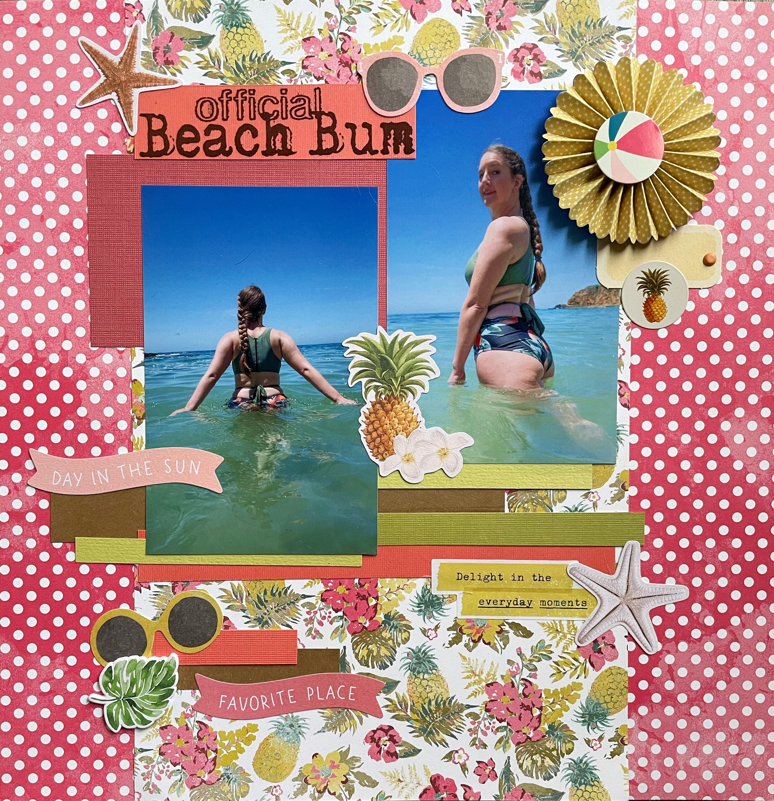
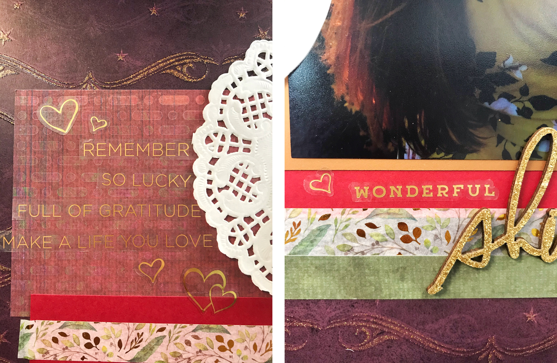
I used a piece of magenta paper with embossed stars from the DCWV Star Dust stack. In the photos, it looks more purple for some reason but in real life, it’s much more pink. I used paper from DCWV’s No Probllama stack to mat my photo and the layered on some random pieces of paper from my scrap stash. The floral paper with a dark gray background matched absolutely perfectly! I don’t even remember the original page I used it for but I’m glad I saved the small pieces that were left over. I finally cracked open some 49 Market Vintage Washi Tape in Lilac and added a couple of strips. I also used some die cuts from Kaiser Craft’s Violet Crush collection. A few brads and tiny tags complete the page.

I find the easiest way to work with pre-embellished paper is to find the part of it I would like to feature, in this case it was the gold stars. I then pulled items out of my stash and compared them both to the challenge color palette and the background paper to make sure the colors would be a good match. In this way, I was able to make the most of the existing embellishments while still being able to build upon them.

143177284_10221842004593495_4174003077109193347_n.jpg

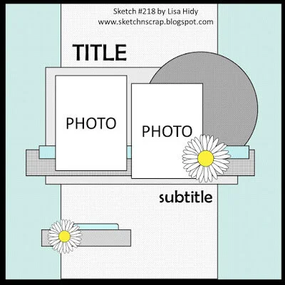
This page was created for the 1 2 3 Challenge Blog. I loved their sketch for February and some of the printed embellishments on my background paper seemed to match the sketch really well. I focused on the darker magenta color (obviously) and used the gray and orchid colors to accent. The words Always Together fit well for my photo because my cat Jupiter always wants to be around m husband and I, even if it’s just in the same room.

That’s all for now. Thank you for visiting and I’ll see you next time!

Scrapbook Challenge

Explore Blue Lagoon

Stripes And Mixed Patterns

IMG_0117.jpeg

Hi everyone! I’m spending a cool and cloudy weekend putting together another page for you all. Today is the perfect day to stay inside and be cozy. I picked up crepes from a French restaurant down the street and made some hot tea for a perfect brunch. I can never choose between sweet and savory so I got one of each! What’s your favorite food to eat on a cloudy or rainy day?

The photos I used were from a trip to Iceland back in 2018 (remember international travel) and we took a trip to the famous Blue Lagoon spa. The pools are heated naturally by geothermal energy. Even in the chilly air the water bordered on uncomfortably hot if you stood too close to the vents. They offered free algae mud masks (which is what I have all over my face) and they had a bar IN the pool (hence the drinks.) When we can all travel safely again, I highly recommend visiting if you can!

Untitled.png

I started with a piece of pale blue striped paper and cut a diagonal stripe of gray and white scalloped paper. Since it was cut diagonally and longer than my 12 X 12 guillotine paper cutter, I had to cut it with scissors. I can never cut a straight line to save my life so I’m proud this time it doesn’t look too terribly crooked. I traced an upside-down bowl to make the circle and used some black and blue ribbon to embellish.

02Feb 8 SIT.jpg

This page was created for the Sketched in Thyme February challenge. I stayed pretty true to the sketch but added embellishment clusters like I normally do, complete with enamel dots (of course!) These ones were from My Mind’s Eye Tutti Frutti pack.

Other products used:

Thanks for visiting and I hope you’re enjoying crepes or whatever your favorite weekend treat is wherever you are!

Scrapbook Challenge

Official Beach Bum

Tropical Trends And Paper Scraps

IMG_0076.jpeg

Hi scrappers! Welcome back to my page! I stopped being lazy and finally put together another layout. I feel like I went into hyperdrive making pages last year when we were all locked down in quarantine. I was experiencing a little bit of scrapbook burnout, but finally got motivated over the weekend to put a page together.

These photos were taken pre pandemic in Laguna Beach on a day when the water was especially clear and not freezing cold. I had just gotten a new swimsuit from CupShe and wanted to try it out! These days the beaches are usually way too crowded on nice days to risk visiting, plus the water is absolutely frigid this time of year. I’m dreaming of summer, but with summer comes crowds so I don’t know when I’ll get to be a beach bum again.

Untitled.png

I had his piece of tropical print paper from Authentique’s Utopia stack picked out for a while but just hadn’t found a page to use it on yet. The whole stack features vintage tropical prints so I knew a beach photo would fit the theme perfectly. This paper is actually double-sided and I found a large scrap in my scrap collection of the same paper so I was able to feature both prints. This is why I always save my scraps! You never know when they will come in handy.

Speaking of scraps, all of the solid colored papers are from my scrap stash as well. I cut small strips and layered them along with some pink paper banners from Simple Stories Vintage Coastal Bits & Pieces. The starfish and pineapple with plumeria flowers comes from this collection too. A small paper fan from Echo Park’s Summer Fun collection matched the color scheme as well.

sketch #218.jpg

This page was made for the Sketch N Scrap February challenge. This layout was practically made for double sided paper so it worked really well with what I had. I coordinated the rest of the layout’s colors to match with the floral print so everything looked cohesive.

Thank you for visiting everyone! I’ll see you next time.

Scrapbook Challenge

Wild Adventure

Teal Collage

image_6483441(18).JPG

Hello everyone! Welcome to this week’s reveal. This time, it’s a very teal reveal. I really love how this page turned out! I tend to gravitate towards turquoise and teal in a lot of my layouts, but this one is almost completely monochromatic. I used a photo my husband snapped of himself during our trip to June Lake last year. I love how the teal contrasts with the yellow of the trees and his orange shirt. The colors in the photo really pop!

Untitled.png

I started with a piece of cardstock from The Paper Studio’s Splash cardstock stack. I added paper from the Entirely Textures stack and Vicki Boutin. From there, I pulled anything and everything teal from my stash and created a collage around my 5 X 7 photo. I tried to list some of the products used but most are ancient and no longer available since it takes me a very long time to use up anything I buy.

Untitled-7.jpg

This page was created for the Scrap the Boys January challenge. Isn’t their mood board for the month awesome?! I stuck to mostly teal but used small circular puffy stickers to incorporate lime, orange and blue details.

Thanks for joining me scrappers! Have a wonderful week!

Scrapbook Challenge

June Lake

Autumn Colors + Pink

image_6483441(15).JPG

Hi scrappers! Well, we made it two weeks into 2021 with only a little it of mayhem. Improvement? I hope so. Who’s to say?

This week’s page feature’s some photos of my husband and I at June Lake which is near Mammoth in California. with international travel options being limited, we took a vacation about 5 hours North. I had never been and we just happened to go when the leaves were changing. It’s not as dramatic as what you would see on the East Coast of the US, but coming from a place where the leaves don’t really change at all, it was really gorgeous.

Untitled.png

I started with a piece of orange-coral paper from a Vicki Boutin paper pad. All other paper used was miscellaneous paper scraps left over from other projects. That’s why I always save my scraps! Used some some small silk leaves in all colors and a couple of 3D fox stickers by Recollections. These little guys have made appearances on many layouts but I finally used up the pack with these last two. A few enamel dots by Simple Stories and some chipboard alphabet letters by Thickers make for a quick and easy layout.

lisa.jpg

This page was created using the layout from Sketch-N-Scrap’s January challenge. It’s rare that I make a page with more than two photos, but in this case it was perfect with the photos I had.

This page was also created for the Lasting Memories challenge. This month’s theme is “Places” and the page had to feature somewhere we have visited.

That’s all for now. Stay safe in the new year everyone!

Scrapbook Challenge

Spoiled

Animal Prints And Paw Prints

image_6483441(12).JPG

Greetings scrappers and welcome to 2021! I hope you all made it through last year relatively unscathed. It was a doozy!

This page pictures my kitty Jupiter in her natural state: comfy and sleepy. The “Spoiled” sticker from The Paper Studio pretty much sums it up.

Untitled.png

I started with some yellow tiger print paper from DCWV’s Gone Wild stack. I tore a a strip out of the paper and matted the rest on some gray cardstock. I used some cat washi tape across the torn out section and cute out a few as embellishments as well. Circle punches of various sizes and paw print stickers make up this simple but whimsical page.

#451 Jan 1 2021 Shawn Lahr.jpg

I was a guest designer over at Sketches in Thyme for the month of January. Go check out their site! I used their sketch complete with the torn out section and circles. I used a large dinner plate and traced its outline and then followed that outline with paw print stickers.

Untitled.png

Check out the color palette I created using the Coolors phone app that I used for this page. It’s a great tool if you’re looking for some color inspiration!

That’s all for now. Thanks for visiting my first post of 2021!

Scrapbook Challenge

X-Mas 2019

Mixing Patterns and Layering Papers

image_6483441(10).JPG

Hi everyone! I hope you all have have your Christmas shopping done because the holidays are almost here!

This week I bring you a festive page with some rare Christmas photos. We forget to take photos every year but last year my husband and I snapped a few photos in front of the tree right before opening presents.

Untitled.png

I never do Christmas layouts (because I forget to take the photos!) so this gave me a change to use some seasonal embellishments that have been in my stash for quite a while. I started with a piece of green paper that had the text from ‘Twas the Night Before Christmas’ on it (even though I ended up covering most of it) and paired it with a piece of red satin print paper. Both of these were loose papers I had bought years ago. I try not to buy too many loose papers anymore since I tend to gravitate towards paper stacks instead. Plus, my single sheets tend to get bent up even though I try to store them carefully. How do you store your papers? I bought some plastic holders made for 12 X 12 papers and printed some homemade labels to organize them by color. I’ve included a photo below in case you’re looking for some inspiration.

image_6483441(7).JPG

I used some paper scraps and matted them with red, beige or white cardstock. There was so much paper layering on this layout that it came out very stiff and doesn’t bend at all! I had some ancient K & Company Christmas chipboard stickers I knew I want to use. I cut and matted small squares of bronze metallic paper and placed some of the smaller embellishments on them. I used two tags from Making Memories Mixed and Stitched Tags as frames for the larger embellishments. I finished up with some black and white enamel dots (of course), some golden stars by Jolee’s Boutique, and some fuzzy felt hearts. I’ve had these last two hearts for a very long time and finally used them up here. Doesn’t it feel good to use up old products in your stash? (That means I get to buy new stuff now, right?)

120673369_3576682912449478_1749740215165103024_n.jpg

This page was created for the Scrap Our Stash December sketch challenge. Glittery embellishments and holiday paper also needed to be used. The chipboard stickers, gold stars, and alpha stickers I used for my title and date all are glittery. Sparkle overload! The background paper with text while subtle, I still counted as my holiday paper. I really loved the their designer Sherri DeKnight Caramico’s take on the sketch so I did a semi scrap lift while adding my own touches.

340 copy.jpg

This page was also made for Color, Stories, Inspiration’s December challenge. I used the following “evidence:”

  • Plaid

  • Stripes

  • Text Patterns

  • Christmas/Winter Themed Elements

  • Ribbon

  • Something Fuzzy

  • Glitter

  • Baker’s Twine

That’s all for now. Merry Christmas and Happy Holidays to all!

Scrapbook Challenge

Wonderful Shine

Glittering Gold

image_6483441(5).JPG

Happy December everyone! This week I bring you a page featuring a photo that was taken in the spring of 2019. It had rained a lot the previous winter so the spring bloom was especially vibrant that year. My husband and I went out to a flower field near the beach and got some amazing photos!

Untitled.png

I started with a piece of purple sparkly paper from DCWV’s Dark Romance stack and matted in with a piece of solid green cardstock. I used some paper scraps and some leaves and gold foil washi tape from Washi Tape Shop. (Have you checked them out yet? Their stuff is amazing!) A paper doily, gold doily garland and a painted feather by Paper Studio made up the major accents. A chipboard embellishment by Heidi Swapp and some stickers from Amy Tangerine and Vickie Boutin sticker books make up the title and word components. I didn’t use as many products as I normally do and the page isn’t as complex, but the embellishments I did use packed plenty of punch.

This page was created for the Lasting Memories December challenge. Since it’s December, most blogs are hosting Christmas related challenges. I don’t have a ton of Christmas or winter photos so these are tough for me to do. This one features traditional Christmas colors but without a lot of the more holiday-specific prompts. We were given several elements to choose from to include on our page. I chose the following:

  • Doily

  • The color green

  • The color gold

  • Washi Tape

  • Hearts

Lori Oct Layout.jpg

This page was also created for The Studio Challenges. This month’s challenge was a scrap lift! I chose the above layout by design team member Lori. My embellishments aren’t nearly as elaborate, especially in the upper left and the color scheme I used was completely different from the original. I loved her use of layering papers and it provided the perfect opportunity to use washi tape.

Thanks for visiting everyone. See you next time!

Scrapbook Challenge

Feline Magic

Stickers And Succulents

image_6483441(1).JPG

Hey everyone! Thanks for taking the time amidst the post-Thanksgiving food comas to visit my page! This week’s layout feature’s some striking photos of my kitty Europa that I took with my phone about a year ago. She was sitting in the cat tree looking out the window and the sunlight really highlighted her heterochromia.

Untitled.png

This page ended up with lots of fun little details, so much so that I needed 2 sets of detail photographs for this one! I used some washi tape stickers I had bought on Amazon as well a some brads and a clock charm to decorate the “shelving” I created out of old paper scraps. I used some paper from Paper Studio’s Dendrology stack for a simple background and matted it on some purple cardstock from American Craft’s Spring stack.

Untitled 1.png

I had picked up a package of paper succulents by Little Birdie but had never cracked them open. The colors fit well with this page so I used the whole package. I love how it looks! The only problem is the succulents stick up quite a bit and I try to keep my pages flat(ish) so they will fit in an album. This one will have to go in a frame or shadowbox.

446.jpg

This page was created for the November challenge at Sketches In Thyme. The photos I had matched the sketch perfectly. I used the succulents instead of floral embellishments and changed up their positioning slightly.

337_edited-1.jpg

This page was also created for Colors, Stories, Inspiration’s November challenge. Purple is my favorite color but I haven’t used it on a page lately. I love the color palette they provided as well as the prompt to create shelves. I had never done anything like that before, and what I thought would be a small detail ended up being a major style element on the page.

“Evidence Used”

  • Woodgrain paper

  • Solid paper

  • Florals

  • Create “shelves” to put things on

  • Silver metal

  • Transparent elements

I hoe you love this page as much as I do! Thanks for stopping by.

Scrapbook Challenge

You Inspire Me…You Make My World A Better Place

Khaki And Teal, Masculine Meets Feminine

image_67520257.JPG

Hi everyone! As winter approaches, I bring you a page with a snowy scene taken by my husband last year in Joshua Tree, CA. Apparently is doesn’t snow there very often, but when it does, it’s magical! He took a selfie on his phone to document the occasion.

Untitled.png

The real star of this page is the paper from Heartfelt Creation’s Everyday Heroes stack. I bought this paper years ago but hadn’t used a single sheet until now. I like the combo of khaki, gray and teal. It feels masculine even though the paisley, flowers and butterflies are more feminine features. This paper collection is double-sided and I usually try and feature both sides of the paper on a page, but in this case, the layout looked best with one cohesive side. I used kraft and teal paper scraps and some awesome washi tape from The Washi Tape Shop. I just ordered a bunch of stuff from them and this is the first time I used their products. I love what I’ve seen so far and can’t wait to use their other products. I used some chipboard butterfly stickers by Prima Marketing and some enamel dots by Echo Park.

lu.jpg

This page was created for Sketch-N-Scrap’s November challenge. I liked the simple layout that allowed me to prominently feature my background paper.

November 2020.jpg

This page was also created for the Kraft + November challenge. The theme for this month was bugs! I used chipboard butterfly stickers in addition to the butterflies printed on the paper.

That’s it for now. Thank you for stopping by and have a happy and safe Thanksgiving everyone!

Scrapook Challenge

So Sweet

Coffee and Cream

IMG_4873.jpeg

Hi everyone! This week’s layout is making me crave ice cream! These photos were taken of my husband pre pandemic at a little ice cream shop by the beach. It seems like we don’t go out for treats nearly as often in this new world. I just buy snacks from Trader Joe’s and we eat at home watching Netflix. Is this relatable to anyone else?

Untitled.png

A lot of the products I use on my pages were bought so long ago that when I try and link the products on Amazon, they aren’t being sold there anymore! For example, the tan damask print paper I used for my background is from the DCWV Royal Garden stack. The copyright on the front says 2011, so that gives you an idea of when I bought it! I paired it with some basic white cardstock and some polka dot coffee colored paper from Pink Paislee’s Auburn Lane pad. I also used some paper from the My Mind’s Eye Sunshine pad as well. I used stickers from Paper Studio’s Bottle Cap pack and Amy Tangerine.

savingPNG.JPG

This page was created for the Scrap the Boys November challenge which was a sketch this month. I added hearts instead of stars and used some Bo Bunny brads and some adhesive dots by Jolee’s Boutique to embellish.

Caramel-Latte.jpg
November-Moodboard.jpg

This page was also created for the White…With 1 November challenge, featuring the color Caramel Latte. This was a unique color to match in my stash so I only ended up using a few papers and products to keep it simple. I like the warm coffee tones that make me think of sweet things, just like the ice cream in the photo!

That’s all for this time. Thank you for stopping by!

Scrapbook Challenge

You’re My Favorite Furball

Bold, Bright And Gilded

IMG_4853.jpg

Hi everyone! Welcome back to my blog! Did everyone have a good Halloween? I didn’t do much this year because…Corona. But I can eat candy and dress up anytime, right?

This week’s page features some photos of my cat Jupiter. She loves to soak up the sun on our patio and I took some shots of her while she was sitting outside with me.

Untitled.png

Both the teal and the blue embossed papers are from DCWVs Royal Garden stack which I have had for a very long time. Has anybody actually ever used up a paper pack? I keep buying more and never get through them! These papers are beautiful but are so stylized hat I don’t use them very often so I’m glad I got to utilize two on one page. The orange paper is from Paper Studio’s Entirely Textures stack. I love how it contrasts with the other papers on the page. I used stickers from The Happy Planner’s Colorful Boxes, Rainbow and Vicki Boutin sticker books. The cat stickers I used are absolutely ancient and have been in my stash for at least a decade. I still have a whole sheet left. I never seem to be able to use up stickers either!

Sketch #212.jpg

This page was made for Sketch N Scrap’s November challenge. I didn’t have four photos to use so I tuned the two smaller sections into embellishment clusters. I used some paper flowers and brads by Recollections in the same color scheme.

338.jpg

This layout as also created for Color, Stories, Inspiration’s November Cold Case. I love the challenge to use up old stuff in my stash! Plus the colors in this scene are so pretty! I used the following “clues”:

  • Find some older papers that match some of the colors in The Scene

  • Use older elements with flowers

  • Use older metal items

  • Add old metal brads or eyelets to some of your items

That’s all for this time. Thank you for visiting and I’ll see you next time!

Scrapbook Challenge

We Are Family

Citrus Brights And Polka Dots

IMG_4789.jpg

Hello everyone and welcome back. It’s good to see you again This week I made a layout with some rare photos of an extended family outing. My sister who is a fantastic artist had an art show at Linsday Wildlife Experience. Lots of family I don’t get to see often got together to celebrate her collection of wonderful work. You can check out some of the pieces that were featured and more at my sister’s shop at Red Bubble.

Untitled.png

I started with a piece of tan cardstock and some green spotted paper by Vicki Boutin. I used a wide range of products, but only a few items of each; a sticker here, a paper scrap there. I use some large polka dot stickers from Happy Planner’s Rainbow sticker book and a chipboard lemon slice by Echo Park to set the color and playful tone of the page.

120579337_10220958414904305_6515553886892179881_o.jpg

This page was created for the 123 Challenge Blog’s October challenge. I like the pretty fall inspired colors and the word prompt was perfect to turn into a title about family.

That’s all for this time. Thanks for visiting and stay safe!

Scrapook Challenge

Iceland Selfies

Fall And Foil

IMG_4756.jpg

Greetings scrappers! I hope it’s starting to feel like fall where you are because here in Southern California, it’s still in the 80s or 90s most days! These photos definitely feel more like fall and were taken in October 2018 in Iceland.

Untitled.png

I started with piece of light yellow paper from K & Company and matted it with a gray piece of cardstock. Some paper scraps and silk fall foliage make up this simple page. I added the unexpected element of gold/copper foil. I adhered it by painting thin layer of rubber cement and pressing the foil over the top. I added it to the corners of my leaves along with the perimeter of my page. I’d never used it before on a page but I like how it looks!

lisa.jpg

This page was created for the October challenge at Sketch-N-Scrap. I changed the orientation and amount of photos, but kept the tags and leaves. I added a few more fall-inspired embellishments like the the tag from MAMBI’s Soft Spoken collection and stickers from The Happy Planner’s Wild and Free sticker book.

hello+october.jpg

This page was also created for Scrap Our Stash’s October Challenge. I drew inspiration from the color palette and fall leaves. The mood board had a cute little squirrel so I added my own woodland creature from Bo Bunny brads.

That’s all for this time. Happy fall and happy scappin’!

Scrapbook Challenge

Take Risks Manly Man

Army Green And Masculine Prints

IMG_4680.jpg

Hi everyone! As September draws to a close, I bring you a decidedly more masculine layout than my usual flowery and feminine pages. These photos were a couple of selfies my husband sent me while on one of his many photography excursions. The road to quitting his day job and becoming a self employed photographer was not easy, but my faith in his work ethic and talent never wavered. A sticker with a quote from the Happy Planner Modern Famhouse sticker book says it perfectly: “You were made to do hard things, so just believe in yourself.”

Untitled.png

I started with a piece of metallic olive green paper from DCWV’s Shimmer Stack. From there I raided my stash of paper scraps for green and brown papers. I used prints that are more masculine, like plaids and distressed chevrons. I added some metallic travel-themed washi tape by the Paper Studio and used Thickers chipboard wood grain alphabet letters for the title.

118518465_10220743009839313_3675796670540123510_n.jpg

This page was created for 123 Challenge Blog’s September Challenge. Check them out on Facebook! I kept my layout pretty similar to the original sketch, except I switched out any floral embellishments and added some extra tags.

That’s all for now. Thanks for coming by!

Scrapbook Challenge

Stand Tall My Dear

Yellow-Orange Tones In Iceland

IMG_4669.jpg

Hi everyone! Welcome back to another scrapbook layout. This time I bring you a very fall inspired page, which is appropriate sine October is almost here and these photos were taken in October of 2018. These photos were taken at the same waterfall as the photo I used on my last page. In a country full of gorgeous places, this was probably the most beautiful place we found in Iceland.

Untitled.png

I used a piece of basic white cardstock as my base and added some orange floral paper to half the page. I used a large piece of metallic orange paper from DCWVs Shimmer stack as well as some micro houndstooth and text paper from My Mind’s Eye’s Sunshine paper pad. I used a flower sticker from a pack made for laptops as my title and raided my stash for other embellishments that matched this color. A lot of stuff was either too yellow or too orange, but I was able to utilize the following:

  • Kaiser Crafts Scrap Yard Die Cuts

  • MAMBI Soft Spoken Travel Stickers

  • Recollections Fox Stickers

  • Echo Park Go See Explore Brads

  • Love + Lemons Main Squeeze Brads

  • Carpe Diem Epoxy Metal Clips

  • Vicki Boutin Sticker Book

sketch in thyme sept 21 2020.jpg

This page was created for the Sketches In Thyme week 3 September Challenge . I took some creative liberties by using 2 different sized photos and offsetting them dramatically. I used a smaller circular doily than what is shown in the sketch and added more tags and embellishment clusters per my usual style.

Mandarin.jpg
September-Moodboard.jpg

This page was also created for the White…with 1 September challenge. Look how pretty their mood board is! As soon as I saw this month’s color, I knew I wanted to use photos where I was in this yellow dress. I really like how it turned out.

Thanks for stopping by. I’ll see you all again soon!

Scrapbook Challenge

The Journey To Iceland

Photo Focused With Organic Embellishments

IMG_4637.jpg

Hi everyone! Can you believe September is almost over?! I feel this year has been one quarantine blur from March until now. I guess time still flies even when you’re not having fun!

This week’s photo comes from the trip to Iceland I took with my husband in 2018. We found a little known waterfall tucked away in the hills and proceeded to have the most magical experience of the whole trip. The surroundings looked like it came straight from the pages of a Tolkien novel. I had a dress in my backpack in case we found some especially picturesque scenery and we ended up getting some of my favorite photos ever! Epic vacation photos are definitely one of the perks of marrying a professional photographer.

Untitled.png

I started with a piece of brown cardstock and paired it with some photo realistic woodgrain paper from The Paper Studio’s Dendrology stack.I love this particular print because of the red-orange paint on one edge of the paper which picks up the warm tones in my dress. I used a piece of double-sided paper from Vicki Boutin’s Color Kaleidoscope stack. I wanted to feature both the butterfly and teal floral sides of the paper so I used one as a photo mat and the other as an accent behind my woodgrain paper. I then took some watered down acrylic paint and splattered some droplets around the edges for added interest. I cracked open some Bo Bunny Floral Spice brads and ephemera that I had for a while but never used, The teal colors match my navy and teal floral print and the organic designs continue the nature theme of my wood paper and photo. I also use some wood a cork embellishments from Momenta’s Mixed Media stickers because or their organic material feel.

sos sept sketch.jpg

This page was created for Scrap Our Stash’s September challenge. The criteria was to use a wodgrain patterned paper and an animal embellishment. I found some hummingbird stickers by Little B that worked nicely with my photos.

Other products used:

  • MAMBI Travel Sticker Book

  • Thickers Chipboard Alphabet Stickers

  • Art C Tag Pack

Scrapbook Challenge

One For The Books

Text Prints And Wood Grain

IMG_4594.jpg

Hi everyone! Welcome back to The Scrap Attack! The photo featured in this layout was taken several years ago at Mobius Arch in Alabama Hills, CA. My husband will come here often to take photos of the stars and I came with him on this particular trip. I was reading by the light of my phone to pass the time and he decided to take a shot with me sitting in the arch.

Untitled.png

I started with some blue color block paper from Paper Pizazz’s Tone on Tone Color Block stack. I raided my paper scrap drawer for all other papers and layered them accordingly.

09 Sep - Books and Book Paper.jpg

This page was created for the More Than Words September challenge. Not only does my photo feature a book, but I was able to utilize two papers with text/book print. I had bought a pack of random stickers made for laptops, skateboards, etc and it contained the stack of books sticker which was a perfect fit for this page.

332 copy.jpg

This page was also created for Color, Stories, Inspirations. I absolutely love the challenges they’ve been posting that encourage using up old items in my stash. I have TONS of old stuff, some of it not even opened. However, this does not prevent me from buying new stuff.

I used the following “Product Clues”:

  • Find older papers that match some of the colors in the scene (My background paper comes from a stack that’s at least a decade old and the paper scraps used vary in age, but many of them are ancient too!)

  • Use old papers with a text pattern (Both text papers were originally bough loose leaf from Micheal’s or Joanne’s ages ago. It feels so good using up scraps!)

  • Use older patterns that have a nature theme (I used some tree bark paper from Paper Studio’s Dendrology.)

  • Use older or never-used punches (There was a time when every other layout I made had rounded corners. Then my corner punch got dull and I stopped using it. I discovered I had another one in my stash and I’m not even sure when I bought it! I definitely broke it in on this page and rounded almost everything.)

  • Use older wood elements (I used some wooden buttons by Prima Marketing that I’ve had for a very long time. I also used some tiny wooden clothespins that were originally bought as part of a wedding centerpiece. I also used some more recent chipboard alphabet stickers by Thickers that has a wooden print.

  • Choose an unopened package of something and use as much of what’s in there as you can (Disclaimer: I actually bought these hedgehog stickers by Mrs. Grossman’s not that long ago. Even at the time I thought “when am I ever going to use these?” But they were so cute so I bought them anyway. I was so excited when I saw there was a hedgehog in the inspo pic so I could break these out. I didn’t use very many because I didn’t want a hedgehog invasion, but I’m glad I got to use up a few.

  • Got any older products by 7 Gypsies? Use them! (I had a Junk Journal pack from 7 Gypsies that I hadn’t used very much of. The big tag with stamps matched the color palette so I added it to the page.)

That’s all for now. Thank you for stopping by and keep scappin’!

Scrapbook Challenge

Everything Is Awesome When I Travel

Vibrant Color Palette

IMG_4579.jpg

Hi everyone and welcome to September. As hurricane, tornado AND wildfire season is upon us on top of a global pandemic, I hope everyone is remaining safe and healthy.

The photos I used were from a road trip to Death Valley, CA last year. I’m standing in a normally dry lake bed. It had rained the night before so there was a small amount of standing water that reflected the sky. Since the lake bed is clay, very little water seeps into the group but the daytime temperatures can easily surpass 100 degrees F. In the summer, the water may not last longer than a day, even after a torrential downpour because Death Valley has some of the highest recorded temperatures on earth. My husband and I visited in the spring, but we were still lucky to catch the water when we did. And that white stuff on the ground? It’s not ice. It’s salt! It’s left over from a time when the valley was at the bottom of the ocean. It builds up in striking geometric shapes and reflects the light in amazing ways.

Untitled.png

I started with a piece of soft blue textured paper from an absolutely ancient stack by Paper Pizazz. I’m not sure the company even exists anymore and I’m trying to use up old products. I layered in more purple-blue paper scraps that match the colors in my photos and embellished mainly with stickers and enamel dots.

lisa.jpg

This page was created for Sketch N Scrap’s September challenge. I used 2 photos instead of 3 and downsized the title. I added multiple embellishments to add interest.

This page was also created for Lasting Memories. The theme this month is “around the world” and the word “travel” needed to be used somewhere in my title. I delineated my subtitle from my title by making it smaller and placing it in a tag-shaped sticker.

Sticker books were the product of choice for this layout. The products used are listed below:

IMG_4566.jpeg

This color palette was designed with the Coolers app. I like the red that matches my leggings and the periwinkle that picks up the environment in my photo. Since these palettes randomly generate, the addition of teal is an unexpected surprise that I felt worked great with the other colors.

Scrapbook Challenge

Listen To Your Soul

Marine Metallics

IMG_4550.jpg

Hi everyone! Welcome back for a very summery edition! These photos were taken last year in Oahu (back when traveling was still an option!) My husband took some really fun pictures while we were wading out in the ocean.

Untitled.png

I started with a piece of turquoise and gold patterned paper from DCWV’s Violet Leaf stack. It reminds me of retro metallic wallpaper and matched the teal tones in my photos. I used teal and gray cardstock from Recollections Cool Water collection for photo mats. I also used a piece of gold and white feather print paper from Paper Studio’s Shoppe on the Square stack, but since such small parts are showing, the design almost looks like palm fronds. I used stickers from The Happy Planner’s Colorful Boxes sticker books. I used some gold foil triangles by Paper Studio as well as feather stickers by Recollections to embellish.

August 20 Sketch.jpg

This page was created for The Studio Challenge’s August contest. I liked the multiple photo mats at different angles an kept that element in my final layout. The white hexagon print paper I used had a quote printed on it that I decided to use as a title, even though it is small.

august.PNG

This page was also created for Lindy’s Gang. I loved the color combo and beachy vibes of their inspo picture. I used all three colors and incorporated some stars by Jolee’s Boutique. I also incorporated the hexagon print in the paper I used by My Mind’s Eye.

Thanks for visiting everyone! I’ll see you next time.