Scrapbook Challenge
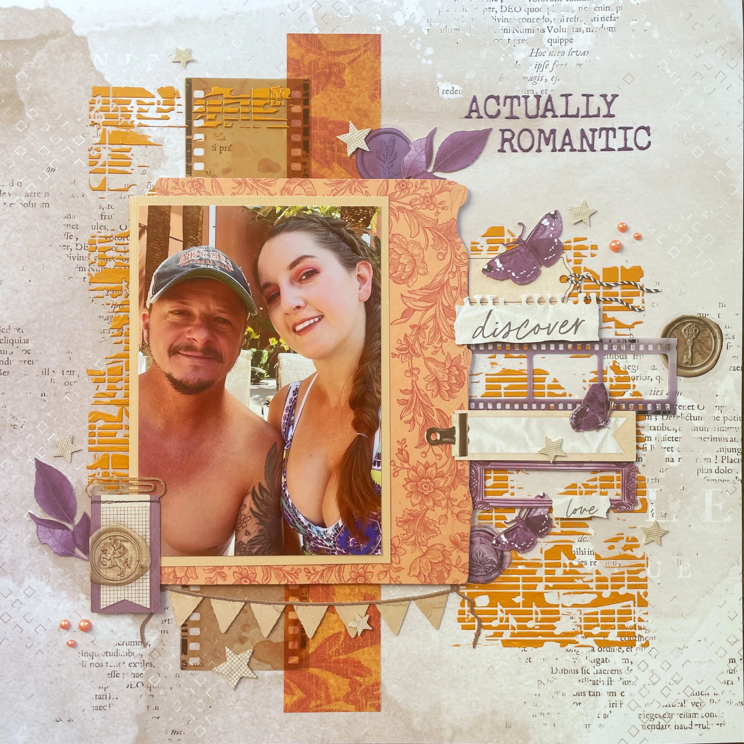
Actually Romantic
Grape, Fig and Beige
Hi everyone! I tried create this page last minute because I found an online challenge whose color palette I really liked. By the time I found it, their challenge only had a few days left to participate so I spent my Sunday afternoon throwing this together!
The photo I used was taken poolside in Las Vegas. I liked the purple pops of color in the photo because I knew I would have that color in the layout too.
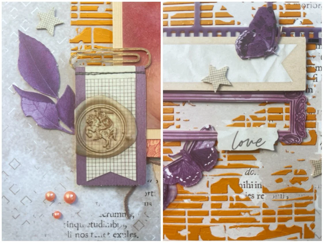
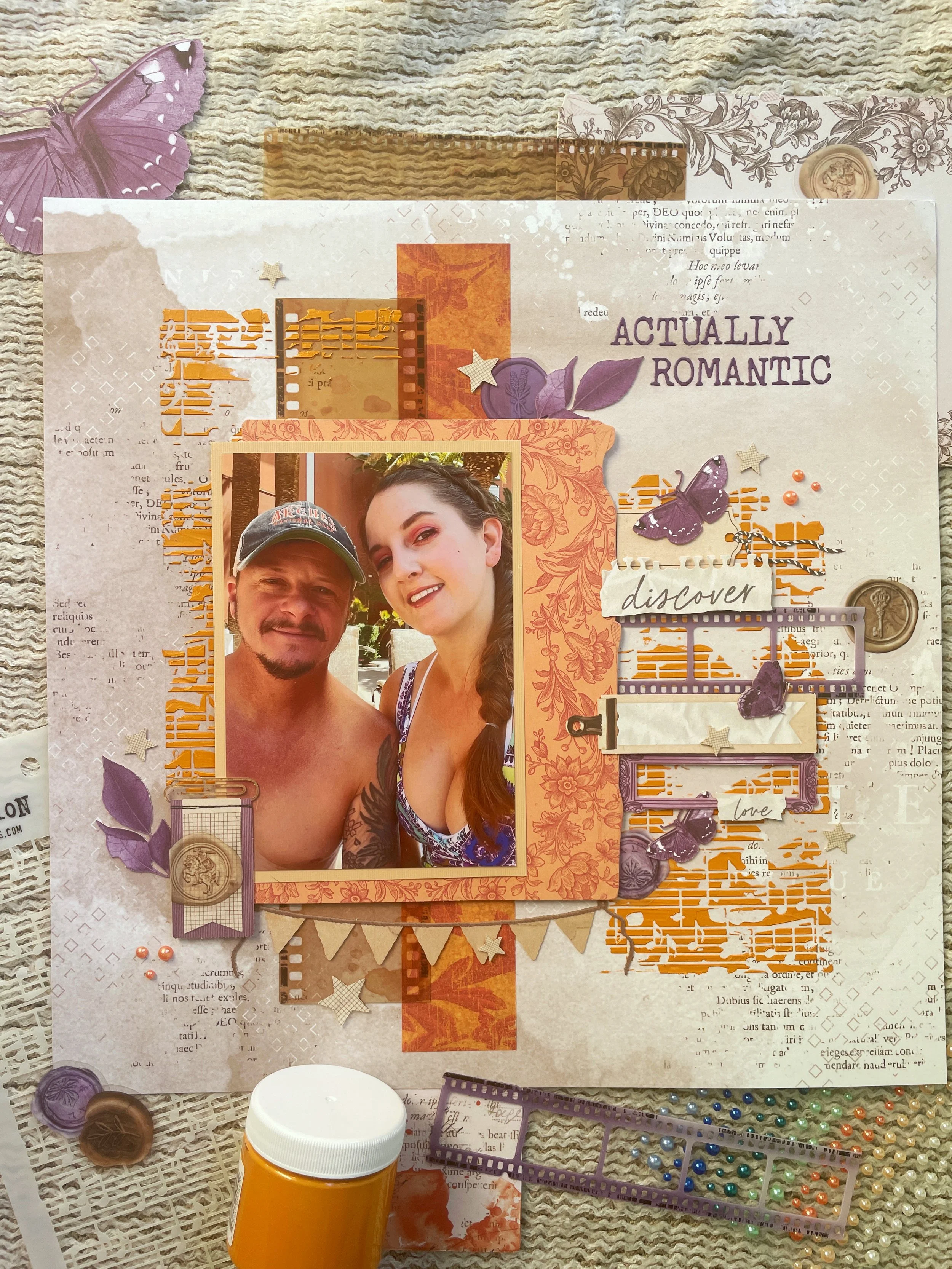
I started with some paper from 49 and Market as my background because I liked its subtle, collage-like design. The only paper scraps I used on this page are the beige paper around my photo and orange leafy print strip behind it. Almost everything else I used is also by 49 and Market with a few exceptions. This includes laser cut ephemera from their Color Swatch Lavender, and Curiosities in Willow Grove collections, Plum Grove ephemera bits, and filmstrips both from the Color Swatch Lavender and Nature Study collections
I experimented with drawing a square on my layout in pencil, and then using a stencil along the edges. I used the Concerto stencil by Tim Holtz since the straight edges on it were easy to match up with the square, and used Apricot stencil butter by The Crafters Workshop. Because the mixed media elements added texture. I used adhesive dots and foam tape to tack down most of my embellishments to make sure they would stick well to the uneven surface.
The title was made with die cut letters by Tim Holtz. It is also the title of a trading song. Can you name the artist? I finished with some wax seal stickers and some little pearls by Honey Bee Stamps.
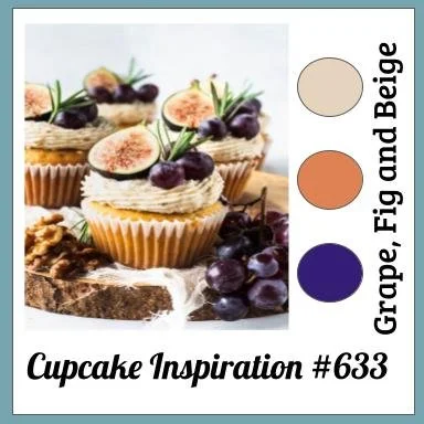
This page was hastily made for Cupcake Inspirations. Not only would I really like to eat these beautiful cupcakes in the inspiration picture, but I loved the color combo. Purple is my favorite and I feel like I don’t use it enough! This is another case where I never would have paired these colors together (because who intentionally picks beige??) but I love how the page turned out.
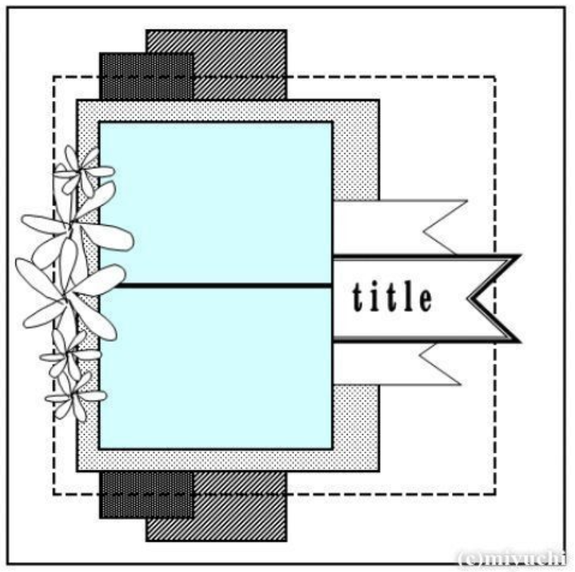
This page is also made for the February Sketch with a Twist challenge. Instead of stitching the square outline, I got creative with stenciling. I liked the page’s simplicity so I could add to it. I ended up embellishing so much on the right side that I decided to omit some elements on the left. The twist was to add pearls or bling and I happened to have pearls in the right color!
That’s all for this time. Thank you for stopping by. I will try and create a few more pages than normal this month since I feel like I wasn’t as prodicutove in January. If you would like to participate in a monthly challenge I host, click here. This month it’s all about calling out your state of province.