Scrapbook Challenge

Apple Of My Eye

Foxes, Fall And Green Apples


Hey friends! This week I bring you a page that's inspired by the warm tones and falling leaves of Autumn. The layout I used called for two photos so I cut one photo in half to make it work for the sketch.

This page really revolved around the green apple paper by Paper Pizazz. The challenge this page was created for had the use of apples in some way. Both the paper and the title became the base for the rest of the page. Many of these embellishments were added to fulfill parts of the challenge and as a result, created a page that I never would have come up with otherwise. 

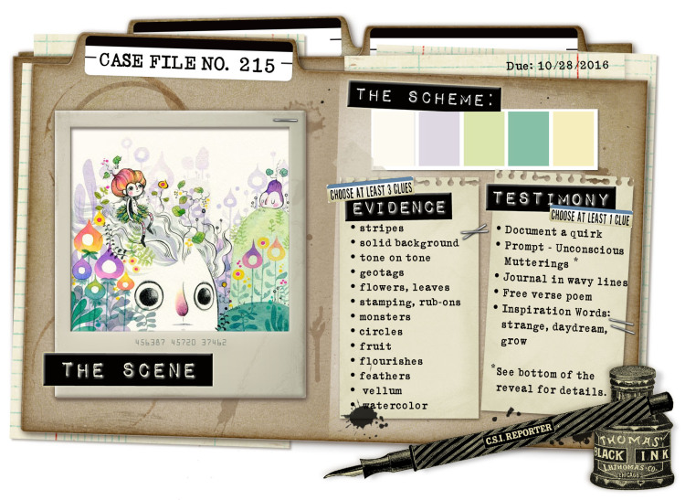
This week's challenge is Color, Story, Inspiration's 217th Case File. The color palette set the tone for the page and I decided to predominantly feature light green tones with the apple paper. Silk leaves and green adhesive dots continue the green theme.

Evidence Used

Testimony Used:

  • Write 3 important things about your photo

Scrapbook Challenge

Cute Fuzzy Adorable Wild Floof

Going Green With Lots Of Letters

This week's layout is fun and fresh, more reminiscent of Spring than Autumn. I miss Summer's warm weather and sunlight after 5pm, but I'm ready for winter rains and Christmas cookies.

This simple page started with a green mandala print from the Everyday Tango stack by My Mind's Eye. I love the touch of glitter on the blue paint, although it doesn't really show in the photographs. I pulled some scraps from my leftover paper bin and utilized them as stripes and photo mats. A few embellishments and a whole lot of alphabet stickers added the finishing touches. The idea for so many letters was inspired by an old challenge from shimelle.com in which the idea was to use as many letter stickers as possible. After digging through my sticker stash, I found a different font for every word. I really like the end result and what a strong design element the title became.

I liked the palette The Studio Challenges chose for their current challenge. I emphasized green and blue tones because they matched my kitty's eyes so well. I love the diagonally lined paper from The Follow Your Heart pad by My Mind's Eye because it so perfectly ties together all the colors and adds a dash of that goldenrod color that wasn't emphasized anywhere else.

I found a sketch I liked from Grand Diva's Creative Corner. I only recently discovered her blog and I thought this particular sketch fit my photo perfectly after i turned it 90 degrees. I even recreated the pennant flags with some baker's twine and more paper scraps.

Here are a few more products used on this particular project:

Scrapbook Challenge

LACMA Lights

Blue Tones And L.A. Landmarks

I've come to the end of my stash of recent photos so I've been digging deep into a box of ancient snapshots. Among old homecoming dance photos, pictures of high school friends and envelopes of negatives (yes, negatives! Like, from a FILM camera!) I came across those shots taken at the LACMA. My sister and I went to the Los Angeles Contemporary Museum of Art several years ago when the Tim Burton exhibit was in town. All these lamp posts are out in front of the museum and have been featured in countless movies and photo shoots. When the sky grows dark and they all turn on at night, the atmosphere is quite magical. If you're ever in the neighborhood, I definitely recommend a visit!

The first November challenge over at Lasting Memories was the use of squares on the page. This criteria was met by cutting the photos themselves into squares as well as using a square shaped canvas sticker by Paper House. I like how it also added a pop of red among all the blues.

For this particular page, I started the process a little differently. Since none of the challenges inspiring this page included a color palette, I went to Design Seeds for some inspiration. This site is fantastic for anyone who loves color. My husband and I actually painted our last apartment using color pairings found on this site. Using their color search tool, I looked for selections that would pair nicely with my photo. This is the one I decided on:

The layout itself was taken from the November challenge at Stuck?! Sketches. The layout was so simplistic that I ended up embellishing it and adding a little more to it and moving where the title was meant to go. I stuck with a simplistic background from the Royal Garden Stack by DCWV. I love the blue tone but it's unusual shiny finish made it difficult to photograph without glare. Textured teal card stock from The Paper Studio's Affinity Stack made for a great mat.

A few other items used on this page are listed here:

Scrapbook Challenge

What The Fluff?

Pastel Pinks And Tiny Tags

Hey scrappers! October is national Breast Cancer Awareness month and this page was done as part of a challenge in which the color pink had to be prominently featured.

This is my kitty Jupiter giving me a look of disapproval. She so expressive that I can't help but laugh at all of her ridiculous grumpy faces. Her pink nose was the reason I chose this photo for this layout since I knew the color scheme was going to include pink.

The color palette for this page as inspired by the ARTastic Challenges October post. The criteria was that the color pink had to be used in the layout but I liked the entire palette of the inspiration photo.

I started with blue floral paper from the DCWV Be Mine stack, a Valentines themed collection that perfectly matched the palette I had in mind. Multiple photo mats and lots of little embellishments around the edges keep the singular focus on the photo.

The layout it adapted from Creative Scrappers 299th sketch. The original called for four photos but I didn't have any photos small enough to work. Instead I used one giant photo and altered the layout accordingly.

Scrapbook Challenge

Journey

Rich Ruby Tones And Hawaiian Waterfalls

These shots are from our 2015 Oahu vacation. We stayed with some friends near Honolulu and went on a fantastic hike that ended at Manoa falls. The misty air at the top felt great after thehike that was pretty much all uphill. I don't hike much so trust me, this was a big accomplishment for me!

This page was created for Scrap Our Stash's October sketch challenge. I turned the sketch 90 degrees counter clockwise to better accommodate the photos I had to work with. From the columns I chose all three colors, (Desert, English Green and French Wine,) and added Flowers from column three too just for fun.  

I started with burgundy patterned paper from the Everyday Tango stack by My Mind's Eye and layered in papers in green, tan and purple tones. I embellished with green paper flowers by The Paper Studio and a wooden token by Maya Road and finished off with assorted buttons, silk flowers, and glass beads from Robin's Nest.

Some of the other products I used are listed below:


Scrapbook Challenge

Here Kitty Kitty

Pastel Papers, Silk Flowers and Stamps!

Hello friends and welcome to my very first blog post!At the heart of every scrapbooking page I create is a photo that is important to me. Now that I've acquired a phone with a camera that is superior to my ancient point-and-shoot, I can snap a pictu…

Hello friends and welcome to my very first blog post!

At the heart of every scrapbooking page I create is a photo that is important to me. Now that I've acquired a phone with a camera that is superior to my ancient point-and-shoot, I can snap a picture anywhere, anytime. Selfies have become a way of life.

This particular photo was taken on my patio where I take many selfies on the days that my makeup turns out nice. (Come on ladies, you know you get excited when your winged eyeliner is on point!) On this particular day my pretty white cat Europa joined me outside and after many attempts, I was able to snap this fun pic of us.

I started with basic white card stock and used watered down acrylics to paint the background since I didn't have actual watercolors on hand. The water from the paints will war the paper so I recommend letting the page dry completely and then leaving several heavy books on it over night to flatten it out.

The mason jar detail was created with a rubber stamp and blue vellum. I placed silk flowers below the vellum to make it look like the jar was full. Puttingfew flowers on the top gave me a way to hide the adhesive that is mounting the vellum to the background.

This page was inspired by Color, Story, Inspiration's 215th case file. I love the quirky illustration and pastel color scheme.

Evidence Used:

Testimony Used:

  • Journal in wavy lines (I used a series of circle stencils to give me a template for my journaling)

I used the Studio Challenges' October 9th Sketch.

For the title, I used a sticker from Paper Studio's Cat Sayings sticker sheet and paw print embellishments are Kitty Puffy stickers by Paper House. The paper kite is from the Song of Spring pack by Paper Embellishments.